Issue
Article
Vol.28 No.1, January 1996
Article
Issue
Issue |
Article |
Vol.28 No.1, January 1996 |
Article |
Issue |
Have you ever noticed that when you are watching a thriller and it reaches its nail-biting peak, the final scene is always played out in a dark, deserted and spooky theatre, a dark, deserted and spooky underground tunnel, or in an ordinary lift.
What is it about lifts? Why is an ordinary lift so scary? Why aren't other interactive systems like coffee machines or video recorders frightening in the same way? It could be that they incorporate the idea of uncontrollable interactive technology (`Open the pod-bay doors Hal') or that the interaction actually involves the user getting transported somewhere.
Anyway, scary or not, lifts are complex, highly-interactive, multi-user systems and are full of good illustrations of user interface design. One nice example that I often quote is the combination of audio and visual feedback used when you are waiting at a group of three or four lifts. Audio feedback is intrusive and powerful, it is good for getting attention and alerting users to changes in the system. Visual feedback is more passive than audio, but it is far more context oriented, it has a spatial element and it can be used to label things and positions. When a lift arrives the `ding-dong' tone alerts you to the fact that something has happened and the lit arrows above the lift doors shows you which lift has arrived. This makes good use of the strengths of each medium. Such a feedback combination is also used on a desk full of 'phones where the 'phones have flashing lights on them so you can see which one is ringing. (A question of timing; in what order should you use the two feedback channels?).
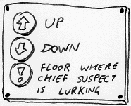
A lift is not just a source of interesting examples of interaction, there are also examples of information presentation. Consider the lift I saw where the buttons for the floors were ordered in two columns to save space on the console, the floor indicator digits were arranged in a horizontal row left-to-right above the door and the list of companies on each floor was done in the conventional order with floor one at the top and floor twelve at the bottom. Three different presentations of the same information, none of which had an accurate relationship to the actual arrangement of the floors!
Then there is the eternal numbering problem. The Europeans start numbering their floors starting from the bottom with the `ground floor' while the Americans start from the bottom with the `first floor'. Further complications arise in European lands where the word for ground floor begins with the letter B and the buttons read `3, 2, 1, B'. The letter `B' can be read as `basement' thus supporting the (in this case incorrect) user model that the American numbering system applies. An interesting solution to this dilemma in floor labelling was used in a tower block for a particular university maths department. It was built in the 60's when there were lots of new and strange ideas about architecture and design. The designers had chosen to use the letters of the alphabet to label the floors. This did have the advantage that the Maths department could be on floor M and computing on floor C and so on, but the weird thing was that they had decided not to include the vowels. Was this to avoid the confusion between the letters I and O and the digits one and zero? I wish I knew. If the architect is reading this will he or she please drop me a line.
However, the most disconcerting of all the lift related information I have seen in a lift was in an international airport. A clearly printed sign in the lift listed the floors and the facilities available on them with an equally clearly printed declaration `you are here' next to floor 2!
To close I should say that you do get the occasional, real-life, lift horror-story. A colleague of mine lived in an apartment block serviced by a secure, key-operated lift that opened directly into the apartments. If you took the lift down to the bottom, the journey was not always as direct as it should be. Sometimes, by some quirk of lift logic, it would stop and open the doors in the third floor apartment, the couple were always out, but over on the other side of the huge, dark living room, their huge, dark dog would suddenly catch sight of you...
Issue |
Article |
Vol.28 No.1, January 1996 |
Article |
Issue |