Author: Alia
Date: 11 January 2006, 3rd revision.
Purpose: To gather first thoughts on semantic design.
Note: some images in this documents is reduced in size. To see it clearly please see it in full size.
Semantic Design: About handing over authorship to the user
1. Motivation
My definition of Semantic Design is presenting semantic information automatically in a way that is perceivable and natural to human. For now, I limit the scope of semantic design to:
a. Relevance of the content of information with the user's goal. [0]
b. The way content is presented, i.e. rules of choosing media, rules of choosing modalities, choosing rules of layout in space and time, could also be a high-end choice such as the style of presentation.
c. Gather rules in order of importance, the next step would be to combining, setting priorities and handling conflicts between rules, and generate a just-in-time presentation, in order to have a harmonious and appropriate presentation.
Katya (and Stefano) have been working on a lot of things in the area of presentation. Katya seems to be seeing things from the perspective of the authors and tools to support them. Stefano's research has a lot to do with rhetorical annotation, generation of argument structure specifically applied to video.
When I scanned some of Katya's paper (I emphasize on some because I have not read all of them and there might be answers to my questions), they are clearly in the direction of helping authors to make a presentation. An interesting question that comes through my mind when reading this: in a perfect world where all online information (the web, in our case) is semantic then the influence of author in a presentation will not be important anymore.
I define an author as a person who: gathers information, filters them, decides which information he/she will use, and then organize all these information together in a presentation.
Ideally, the information presentation should reflect the user (user-centric) rather then the author (author-centric). [1.a]
In other words, the users are the authors: they will choose what kind of information they want to see, how it is presented (eg. news paper style or tabloid style). In addition to this, there are some things which should be automatic: what device the user is currently using, etc.
The next question is how to achieve this. The only researcher I have read that is actively working on similar issue (for different reason) is Bateman and [1].
2. Semantic Design
2.1. Introduction
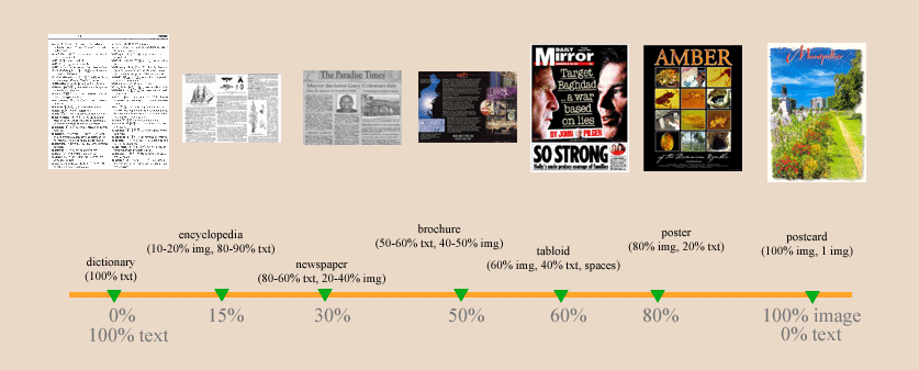
There are basically three media which can be used for the web: text, sound and visual media (this includes image, graph, table and video). One can debate that table is a text media, but considering the cognitive process for a human to perceive a table, I tend to categories them as visual media (or something in between text and visual). Sound and video will be not be considered at the time being because: 1. at the time being Eculture does not use nor possess any sound nor video artwork repository. 2. to simplify the model, sound and video both have temporal presentation dimension. Note that in the future, sound and video can be used but probably in a different domain (e.g. movie & music repository).[2][3]
Important: while the design books (universal design guidelines & a non-designers design hand book) I have read gives inspiration on what design elements are important, it does not give me concrete information on how to formalize a design. I find them too abstract and does not solve design problems which I need for the art domain. Thus, my approach for design formalization is a combination of "mimicking" (ie. to follow the work flow of a web designer [4]) and applying design rules from the two design books previously mentioned. Section 2.2. will largely discuss generating design rules by mimicking. Another thing that I realized after comparing the news domain and the art domain: (my temporary hypothesis is) probably the domain knowledge is important when you want to have a fine-tuned presentation. (I am not fully convince of this yet, after exploring other domain beside the art domain then i can be sure.) [5]
2.2. Scope of the semantic design
Basically any type of domain can follow the same process of automatic presentation generation:
consider what media is available (the media profile)
arrange proportions of different medias (presentation stereotype)
arrange them into a layout
after gathering rules in order of importance, the next step would be to combining, setting priorities and handling conflicts between rules, and generate a just-in-time presentation, in order to have a harmonious and appropriate presentation. [6]
2.2.1. Basic principles
Basic principles of presentation:
a. Level of importance of information. Information are not equal and some information is more relevant then others. Thus, information should not be presented in an equal way.
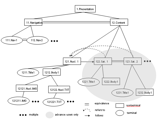
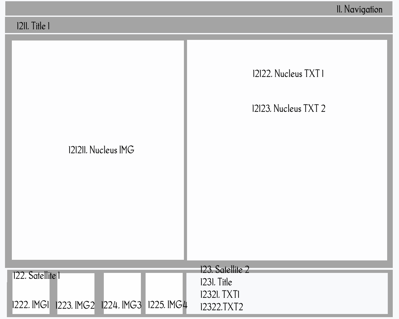
E.g. navigation section is more important then content section. Analog terms used in RST theory are called nucleus and satellite.
b. Relationship between information. Three concepts of relationships between information in Rhetorical Structure Theory (RST) [7] :
Presentational Relations e.g. background, antithesis, motivation, summary.
Multinuclear Relations e.g. joint, contrast, list.
Subject Matter Relations e.g. condition, elaboration, evaluation.
2.2.1.1. Elaboration relationship: an example [8]
Satellite information presents additional detail about the situation or some element of subject matter which is presented in nucleus or inferentially accessible in Nucleus in one or more of the ways listed below. In the list, if nucleus presents the first member of any pair, then satellite includes the second:
Further elaboration example on how to use RST rules in relation to user profile is explained in 2.2.3.
2.2.2. About level of importance of information
1. Information belonging to the same group (and subgroup) should be
clustered
together and vice versa, information belonging to different group should not be
clustered.
2. Information which has a higher importance should get more attention in a
presentation rather then less important ones.
3. Information with the same level of importance should share equal attention
in a presentation.
Note: Importance of information is determined by "something" outside design rule. For example from rules of how relevant the information is to the users' goal.
2.2.3. About User Profile: Who are the users and what kind of information do they want to have?
Consider two type of user from an art domain: novice and advance.
A novice user is a person who does not know much about art but is interested to know about them. He might admire a painting when he sees it, but do not know who made it and what style does it belong to. Thus, information interesting to him tends to be only the nucleus information (description on the artwork-art style-artist). Sample use case for novice: General information about the painting: who is the artist of this painting, tell me more about this painting, what is the style of this painting, how can i recognize a certain art style or painter by just looking at a painting.
An advance user is a person who is well informed of the nucleus information. This user is more interested in further elaboration on the nucleus information with related information (satellite) e.g. by investigating what is the specific relationship between different art style through out time or which artists know each other and how this influences their paintings. Sample use case for advance: what other art styles is related to a particular art styles and in what way, which artist knows each other and if they ever collaborated, is there any characteristics of a particular painting which is worth noticing (certain brush strokes, color combination, subject of the painting)? or to see specific annotation on a particular painting which is made by the curator.
We can see that for novice user information should concentrate on the nucleus information only whereas for advance user, satellite information is as important as nucleus information.
| user profile | design rule: nucleus-satellite information ratio |
| novice | 100% nucleus information, 0% satellite information |
| advance | 60% nucleus information, 40% satellite information |
Note:
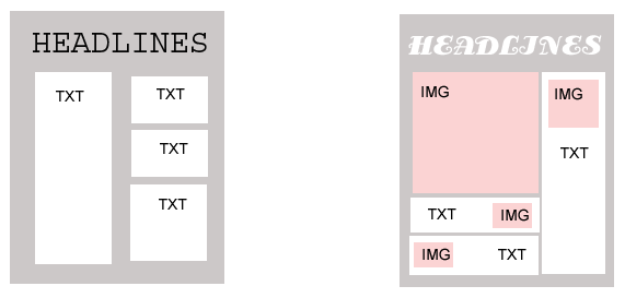
1. nucleus information is the information which is the main attention e.g. the artwork, the art style, the artist.2.2.4. About presentation stereotypes and their media proportions [9]
It is inevitable that different domains have different media profiles: e.g. art-museum (only text and image), music (only sound and text). In the case of art-museum there is only two media available: text and image. Thus, we will consider only these two media type. These media can be richly presented in different proportion.
figure 1. the presentation stereotypes, the proportion of different media and their examples
| presentation style | design rule: media proportion |
| art domain | brochure type 50% image, 50% text |
2.2.5. Layout rule (Some taken from interpreted from the book "universal design guidelines")
Clustering can be achieved by several ways e.g. color coded, placed closer to each other (proximity).
Attention to information can be achieved by several ways e.g. allocate a larger portion of space, placing information in attention areas (e.g. top left-corner), use attention grabber element (e.g. use bright or warm colors).
In addition to 2.2.2. and 2.2.3. there are additional layout rules:
1. Fill the space of the presentation from top-left down to the bottom-right area.
2. Nucleus title should be on the top area
3. Navigation should also be on the top area (or on the left side as a column if there are many navigation items)
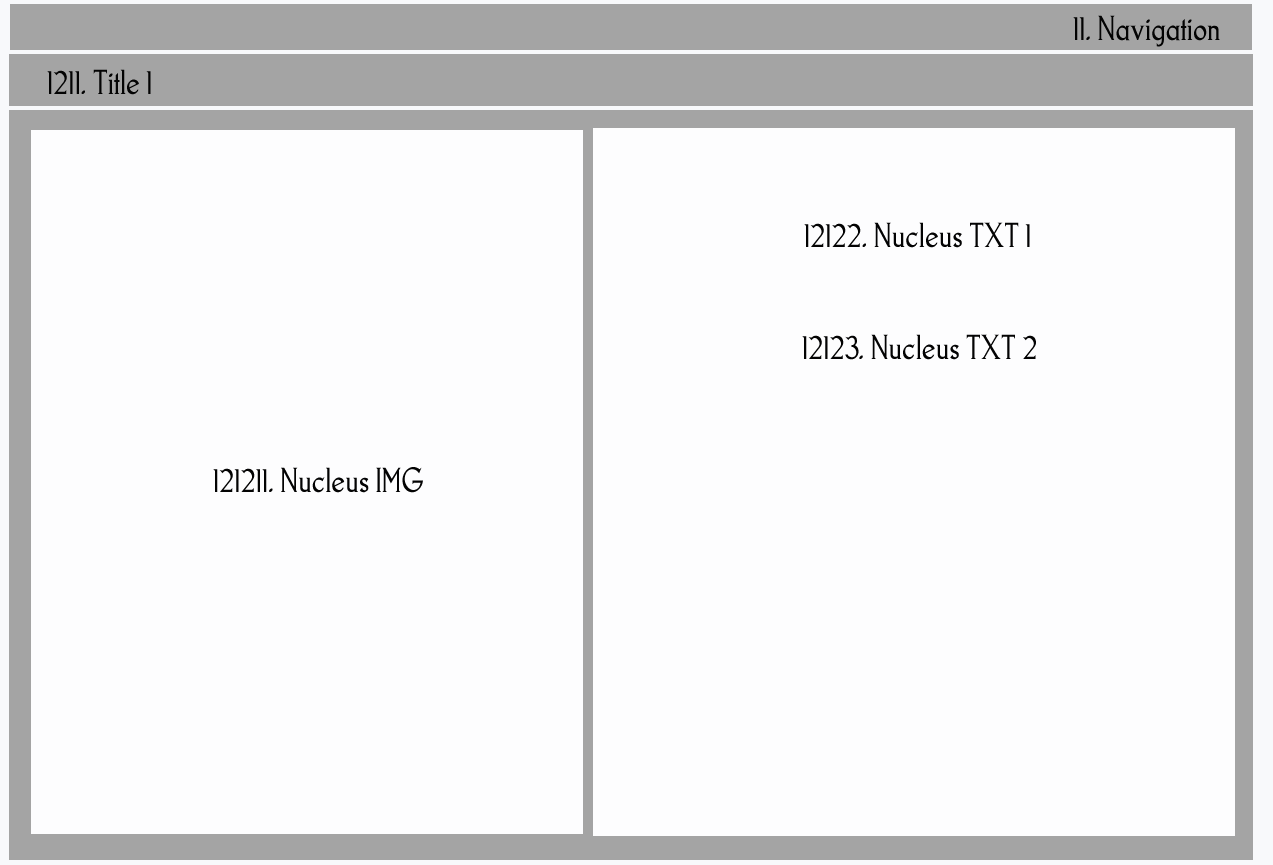
4. If the media item is much bigger then the assign space or if there are more then one media (e.g. many images for the same artwork or many different texts) for a media cluster then resize & divide the area equally to fill the assign space. [11]
5. If the media item is smaller then the assign space (eg. nucleus img is small; a small portrait of the artist) then the same information cluster (e.g. nucleus txt) can take benefit of the space. The ratio of nucleus-satellite information cluster will still be the same.
5. Use colors which is harmonious (rule on harmonious color will follow. I have seen in one good article but I forgot where I saw it.) and check for color blindness if necessary according to the user profile.
| Novice | Advance | |
| Layout Structure for Eculture adapted from [10] |
|
|
| Assign spatial relation rule | ||
| 1. Assign the space for every media type. |
nucleus img: 0.5*1=50% nucleus txt:0.5*1=50% satellite image: 0% satellite text: 0% |
nucleus img: 0.5*0.4=20% nucleus txt: 0.5*0.6=30% satellite img: 0.5*0.6=30% |
| 2. cluster the same media items together. |
left side:
images only nucleus img: 50% right side: text only nucleus txt 50% |
left side:
images only nucleus img: 20% and satellite img: 20% right side: txt only nucleus txt: 30% and satellite txt: 30% |
|
Page Layout (generated according to the rule) corresponding to the layout structure. |
 |
 |
| Assign style rule: color, font, size, shape of background, etc. | ||
| Color rules | to be define later. right now take: black (text), grey (frame), white (background) and blue (hyperlink) as default. | to be define later. right now take: black(text), grey (frame), white (background) and blue (hyperlink) as default. |
| Layout with media items assign to their spaces | ||
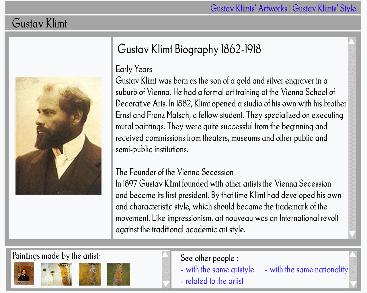
| Artwork |
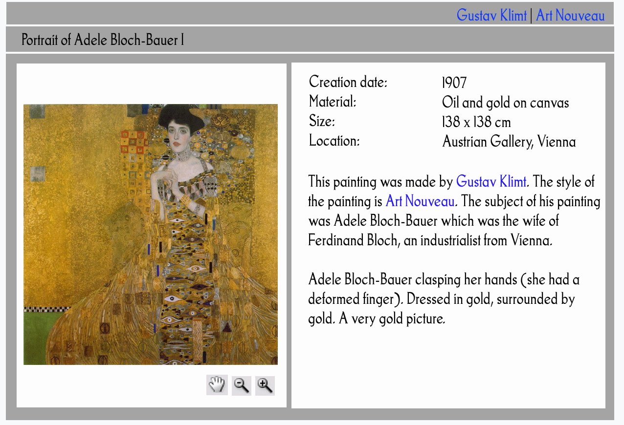 |
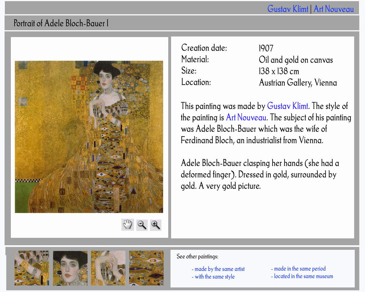 |
| Artist |
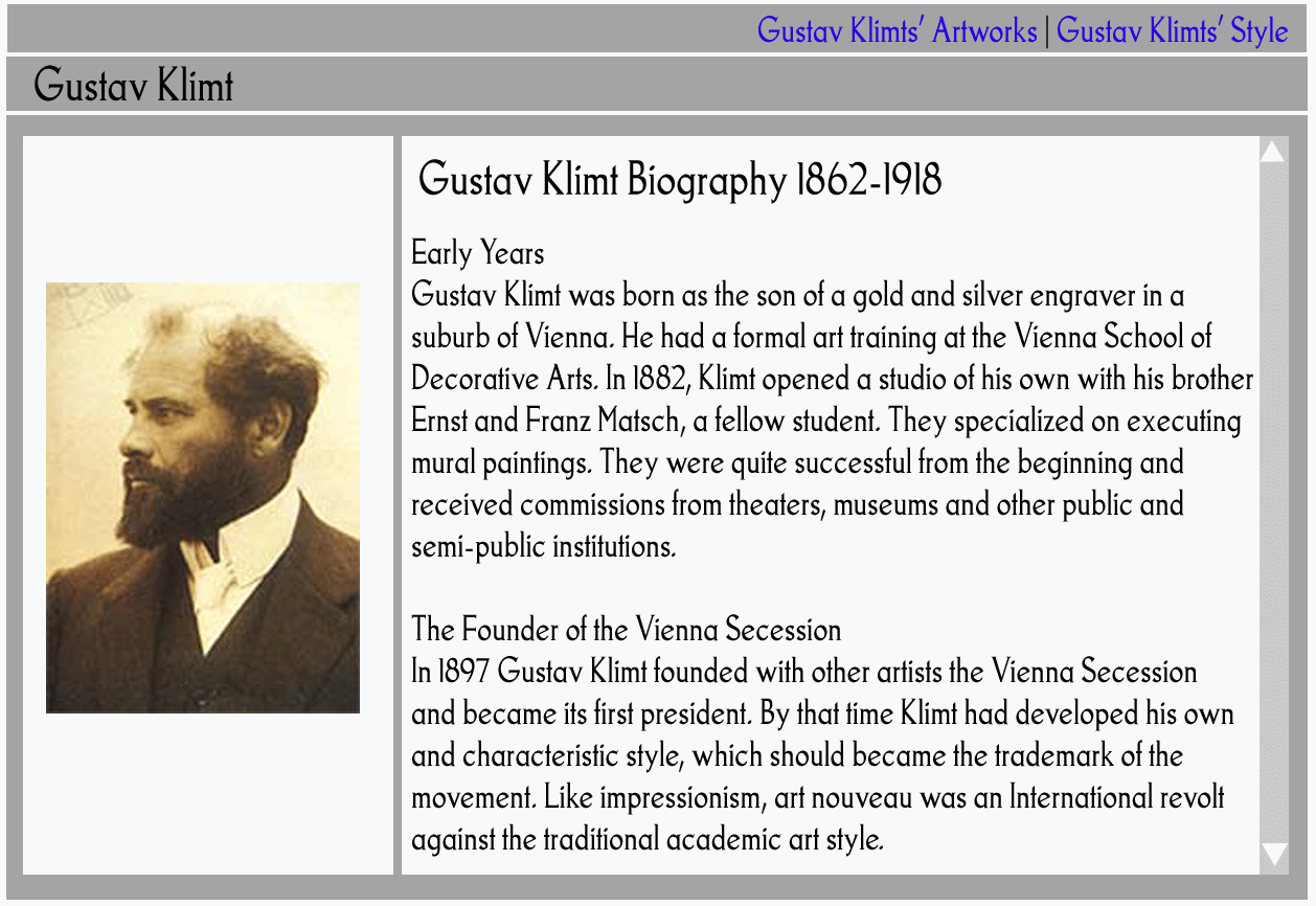 |
 |
| note: | notice that the layout is slightly different for the artist, the reason is portrait size is smaller then the layout, according to the layout rule then the nucleus txt may take some of the space from the nucleus img. The result is still the same: eventhough the portion of the img-txt changes, the nucleus information cluster still have exactly the same space. | |
Table 1. Semantic Design Summary
3. How semantic design will change how web pages are handled
Traditionally, content providers put A LOT of effort into designing and organizing information in their interfaces. There is also a lot of effort made to ensure these interfaces are satisfactory with repeated user evaluation for many different user segment. Using semantic design technology will have an impact on:
1. the way content providers work: to get more variance of design for the same effort and able to nucleus more on providing diverse contents (including different media & style).
2. the what user evaluation will nucleus on: instead of testing the end-product (the interface), user evaluation of the system will be more interested in finding out if all important parameters for users to change are there and satisfaction criteria will be based on evaluation if the user parameters translate correctly to the interface. (Note: the first is quite feasible for any domain, the second I do not know how to do this yet).
3. It is probably worth mentioning that if all design rules are implemented in a good way, I am optimistic that the result would be a decent interface. However, I believe it will be quite dull and unattractive (consequently nobody would appreciate benefit semantic design). This is where aesthetics should be one important element of semantic design. The study of aesthetics will be in a much later stage of this research. In short, aesthetics covers a broader scope then usability issues. Some element of aesthetics are taken from the book universal principles of design: composition, balance, contrast, order, sequence, mimicry, symmetry, etc.
4. What I want to do
Implement Semantic Design, by following the procedure already described in detail (hopefully) in Table 1.
5. Why art domain and not other domain
At the beginning, I was quite tempted to take the news domain as an example. The news domain has simpler rule and give more obvious differences in presentation result then the art domain. The news domain also has richer content, i.e. lots of different chunks of text and pictures which is dynamically changing. Furthermore the content is not controlled by our own server, information changes continuously, the user segment difference is simpler to define real time (basically only user preference) and people can relate to this segment faster which makes demonstration of the benefit of semantic design more convincing. I will probably come back to this in the future to test if presentation can indeed be domain knowledge independent. See appendix for a use case of in the news domain.
6. Appendix: The Semantic Design for the News Domain
Tom works as an financial advisor in a company.
Tom is looking for the news, the webpage will show first as headlines: the financial news, stock news, and then in smaller format the national news, local weather news, etc. Tom prefers these information to be presented in forms of texts, numbers and graphs. Pictures are not appealing to him. He likes to see financial news in big headlines first on top of the page and all other news in smaller font on the bottom of the page. And that is exactly what the system does for him. Alternatively, he also access his presentation via his PDA when he is away from the computer and set the system to alarm him whenever there is new information on a particular stock he is interested in.
His wife, Saskia, also wants to keep up to date with the latest news which are interesting for her. Topics interesting for her are fashion, gossip, horoscope and music. Saskia appreciates more lively pictures presented to her and does not like too much text in her news presentation. One last thing: Saskia is partially color blind; she can not differ blue and green. The system should make sure that no blue and green color are used to differ functions.
Below are news interfaces for both of them left is for Tom and right is for Saskia.
7. Notes:
[0] Lynda's comment: probably more Information Retrieval scope.
[1] Refer to Jane Hunter's work too.
[1.a] Katya' definition of an author is someone who is active in modifying/creating something in a system, whom is opposite to the user (someone which is passive and is a viewer). She never made a formal definition of an author in her paper.
[2] There should be several tricky issues related to using different media which I should elaborate in a later stage of my research.
[3] Refer also to Lynda's thesis, work by Niels Ole Bersen and Joost.
[4] Probably we will mimic the same designer's work flow in the design rules, with a big difference: in semantic design the design rules are complete whereas designers might only consider several rules on his/her mind (due to designer's experience or preference) and the decision will be based on clear rules rather then subjective designer's judgment.
[5] Lynda and Joost have different opinion about this. Lynda's stand: you can stop at RST to generate a decent presentation. My temporary stand: domain knowledge helps because some information has a traditional way of presentation (e.g. movie domain: poster) which helps users in understanding and accepting the information better.
[6] This is the core of the semantic design research.
[7] Terms used in RST is explained clearly at http://www.sfu.ca/rst/01intro/definitions.html and http://www.sfu.ca/rst/01intro/intro.html for theory
[8] Taken from http://www.sfu.ca/rst/01intro/definitions.html
[9] Lynda's comment: this is either too easy or too difficult and I did not mention anything about modeling. Lynda suggests that this should be in user's characteristic or to be more precise: user's preference. While I agree this can be the case e.g. for news domain. The fact is knowledge domain plays a more important role here then the user's characteristic. In art domain visual information such as images is as important if not more important then the textual information. (Eculture) Art domain is very visual. It does not matter which user you take: novice or advance, for both user the image information is very important. Having said this, I also think in other user-set, user rules influences a lot in presentation stereotype. E.g. Children vs. Adult. Children would prefer a much less text and a larger portion of images then Adult. For the time being, I will treat this as pending item and see how I can incorporate a more general rule.
[10] Towards constructive text, diagram and layout generation for information presentation. (by John Bateman, Thomas Kamps, et.al. )
[11] Joost Thesis discuss this issue.