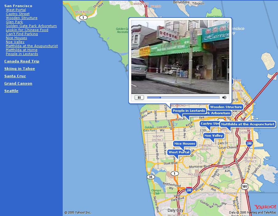
They just used icons with numbers to connect them with items on the list.
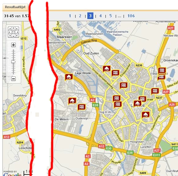
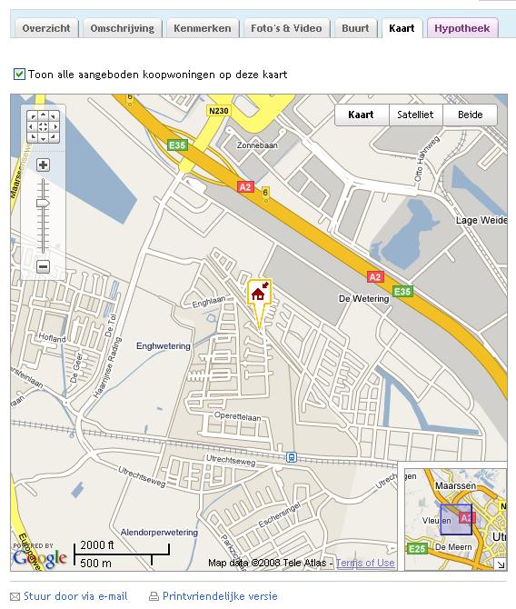
Funda.nl use various icons to presents houses and appartments. One of their interfaces offer google like control of number of details: they present 10-20 items per "page", and you navigate among pages (1, 2, ..... 106).
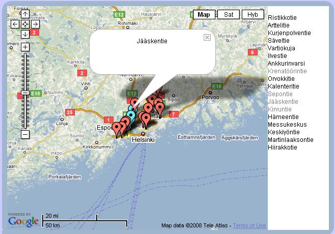
Selected object is shown with different and highlighted icon in the context of other object close to i.
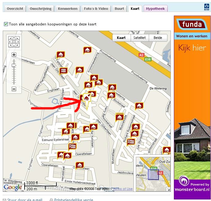
Zoom out removes related object, zoom in keep them.
I had one thought (about this at least :-) ) while at CHI.
When
wanting to indicate the number of "things" on the map, you can also
denote
an area on the map and colour it depending on density. When
density
is low, then you could show individual markers.
This would work
for countries, since they have defined region boundaries.
If you
can't tell what I mean, try these:
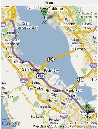
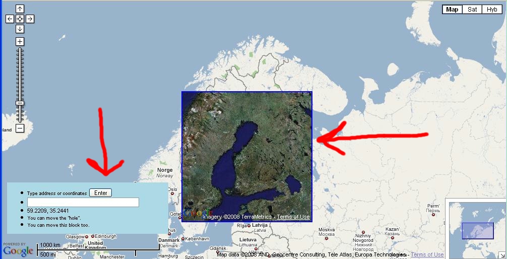
Map
1
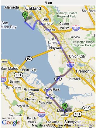
Map2
Lynda
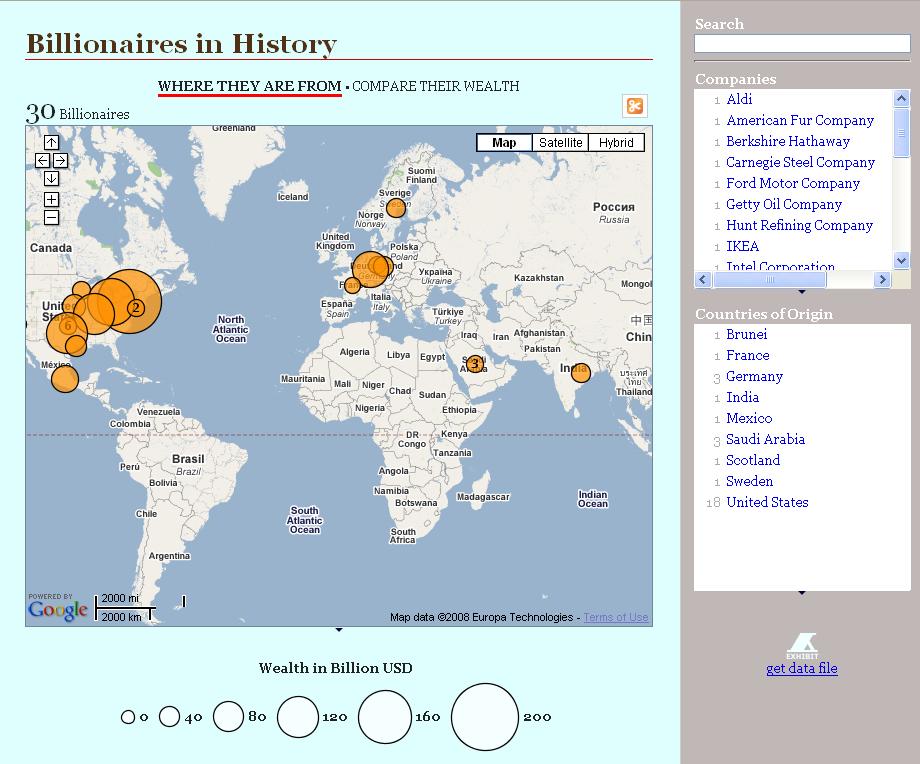
Again using Google Chart API. Can also be used as secondary image to communicate context, i.e. to roughly communicate number of items per country.
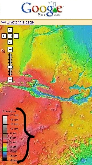
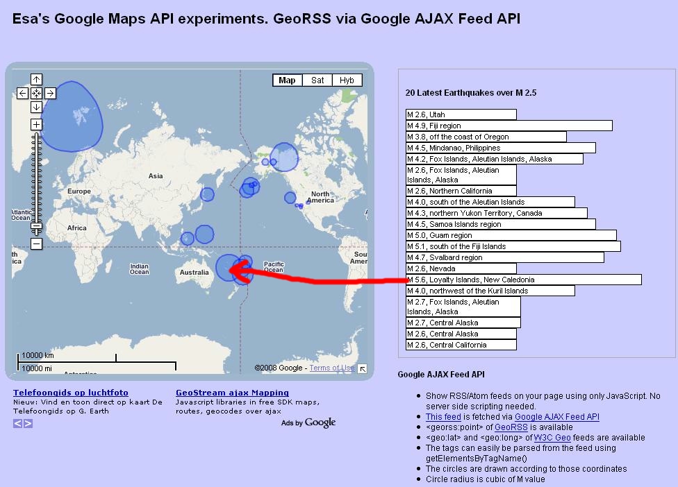
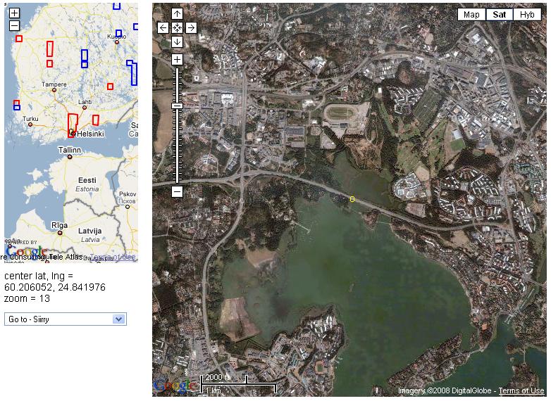
http://esa.ilmari.googlepages.com/earthquakes.htm
Circle radius is cubic of M value.
One of the problems is that Google maps draw a circle on the surface of the earth, which makes them look deformed when presented.
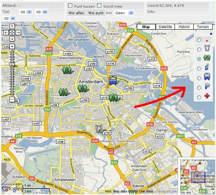
Afstandmeten.nl uses LEGEND within map. It alows addition of selected type of icon. For as is interesting as a way to communicate the meaning of the icons.
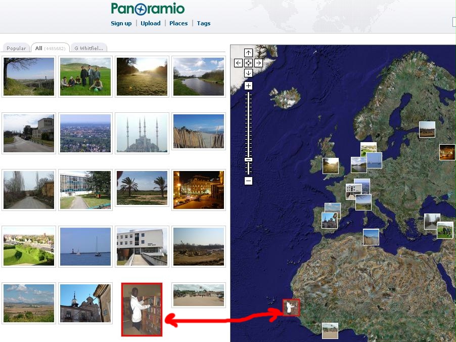
http://www.sodascope.com/FlickrMapsExt/
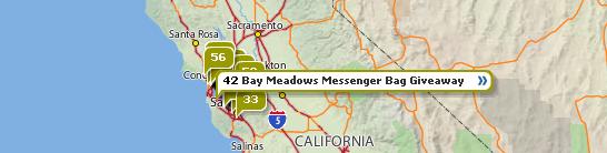
Shows icons with number of items, and on click opens window with linear navigation of images.
Site http://koti.mbnet.fi/ojalesa/exam/index.html provides a list of google map examples.
http://developer.yahoo.com/maps/applications.html
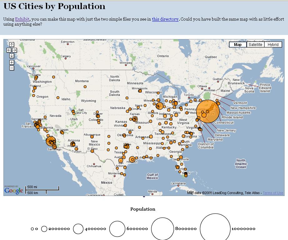
http://simile.mit.edu/exhibit/
Exhibit is a three-tier web application framework written in Javascript, which you can include like you would include Google Maps.
If you just want to show a few hundred records of data on maps, timelines, scatter plots, interactive tables, etc., why bother learning SQL, ASP, PHP, CGI, or whatever when you can just use Exhibit?
To use Exhibit, you write: a simple data file, and an HTML file in which you specify how the data should be shown. Data + Presentation. That's all there is to publishing, as it should be.
Items that is clicked goes to the front.
http://www.androidtech.com/upcoming-events-map/upcoming-maps-2.php
http://local.yahooapis.com/eb/demo/
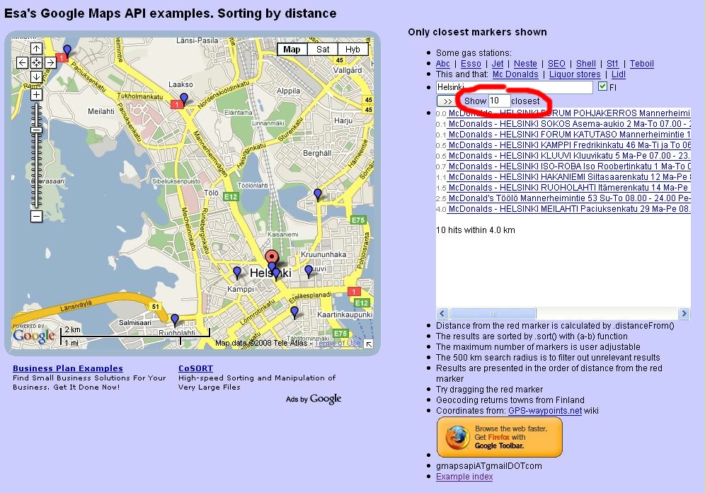
Showing only 10 closest results, within 4.0 km distance range.
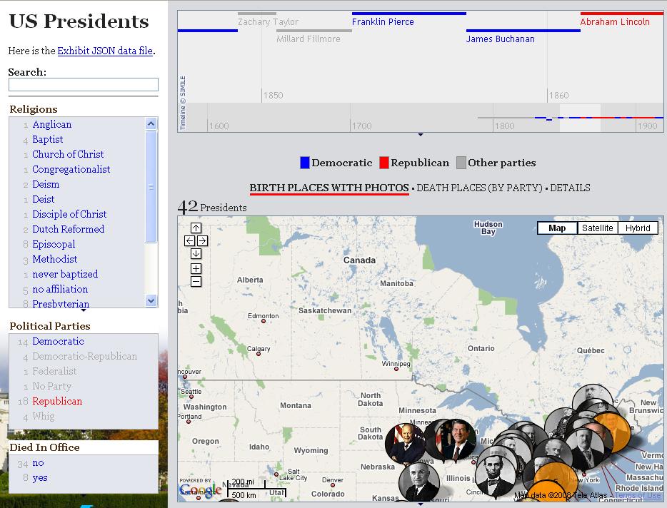
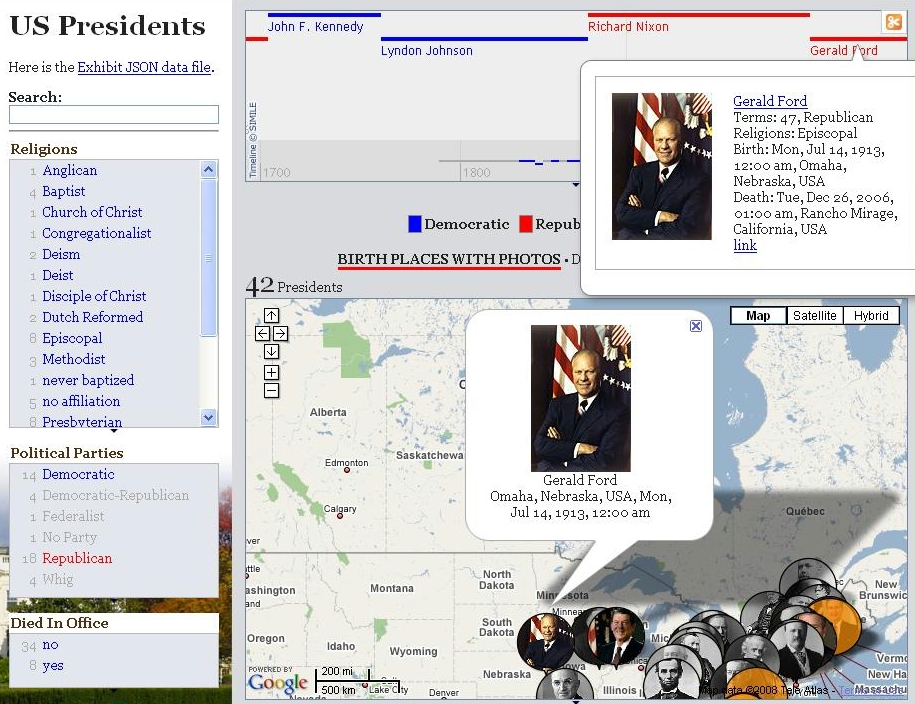
US Presidents
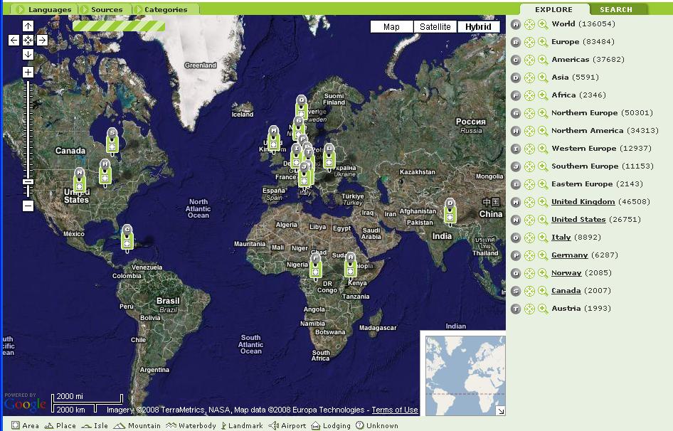
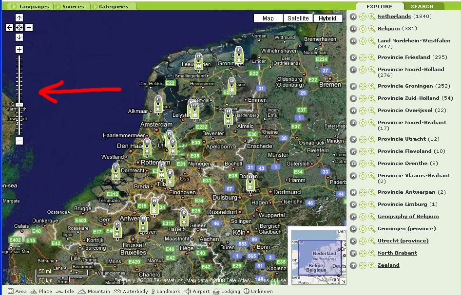
PINTOMAP is the geographic web search engine. The current version includes more than 245,000 articles from Wikipedia, there is more to come.
http://www.pintomap.com/site/nl/fs_top/map.html
At first level, articles are grouped at continent/part of continent level (North Europe, Western Europe....), and only icons for this part are shown.
Another interesting dimension of this interfaces is automatic generation of icons based on semantic data.
When you click on one of the item, Wikipedia is shown, together with zoom in button (with a plus sign).
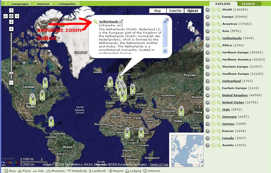
When you click on semantic zoom icon (in this case for the Netherlands), the maps is visualy zoomed in that region and new more detailed icons are shown.
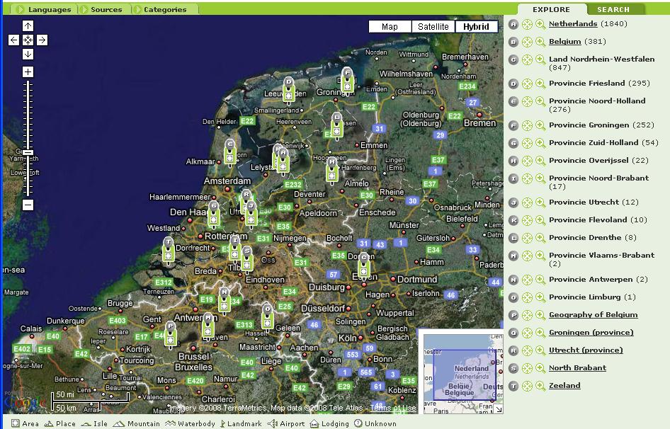
The process of zooming in be repeated until there is no more details (e.g. Western Europe => The Netherlands => North Holland => Amsterdam => Concert gebouw Amsterdam). Visual zoom in and zoom out control also automatically change semantic zoom, i.e. the level of details.
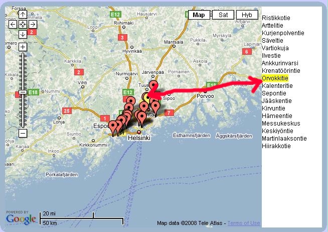
Wikimapia also provides some kind of semantic zoom in where the number of items shown on the map depemnds on the zoom level and size of the group being presented. In initial world view, only the rectabgles with places that have more then soem number (5000 I think) items are shown.
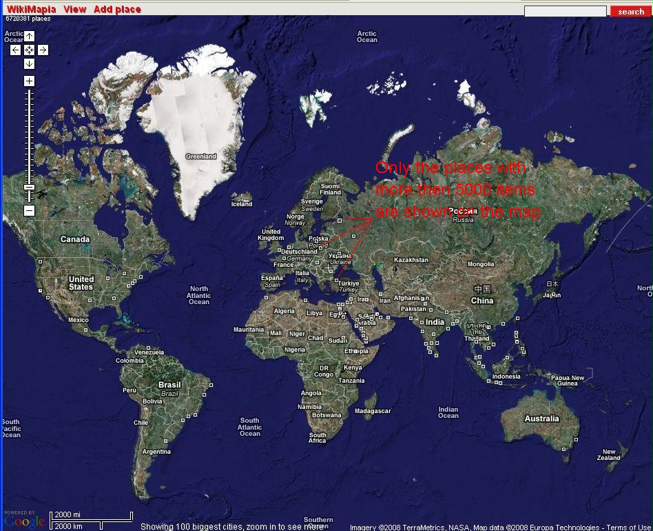
As you zoom in, more rectangles, for places with less items are then shown.
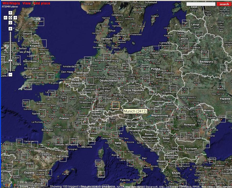
As you zoom in or click on the rectanggle, all the detailed segmentation of the region is shown, in this example this is Amsterdam.
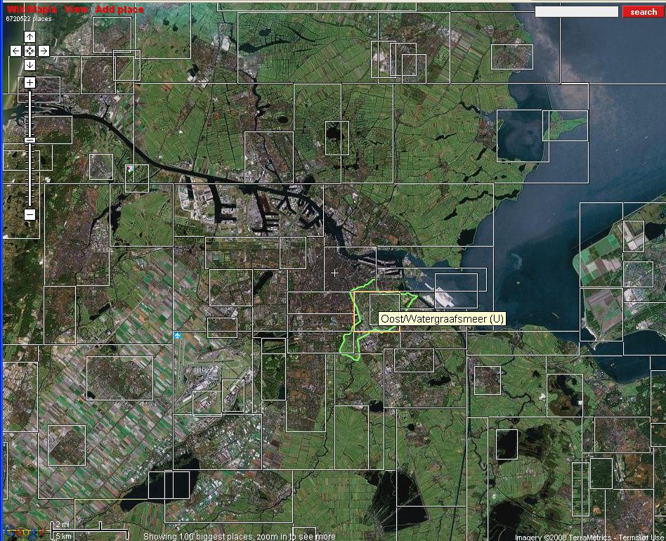
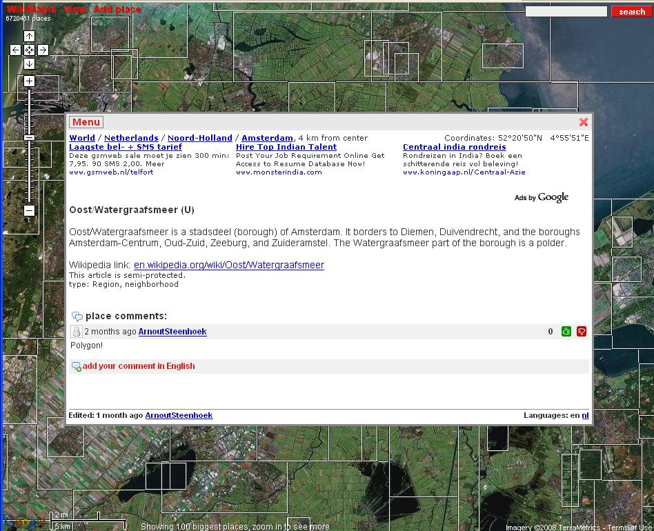
Click on the lowest level item, opens a window with more information for that region, user comments, and commercial.
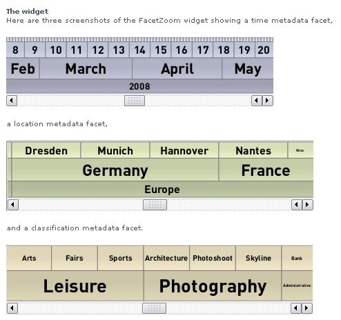
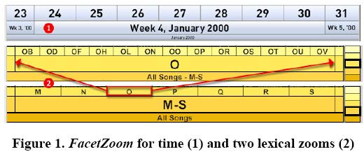
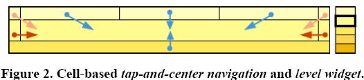
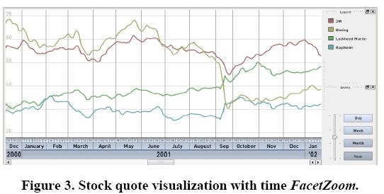
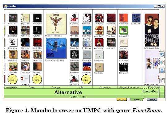
FacetZoom: A Continuous Multi-Scale Widget for Navigating
Hierarchical Metadata (Page 1353)
Raimund Dachselt, Mathias
Frisch, Markus Weiland, Technical Universität Dresden
Faceted
browsing is a promising way to incrementally re-fine data sets. Current
approaches do not scale well in terms of screen size and have
shortcomings in interacting with hierarchical facets. This paper
introduces FacetZoom, a novel multi-scale widget combining facet
browsing with zoomable user interfaces. Hierarchical facets are
displayed as space-filling widgets which allow a fast traversal across
all levels while simultaneously maintaining context. We contribute both
a seamless continuous navigation and a quick tap-and-center interaction.
Two prototypes are de-scribed which successfully apply the
space-structuring wid-get to continuous, sampled data and an information
collec-tion. A formative user study of the latter indicates that the
interface scales well to small screens. FacetZoom is versa-tile and
offers consistent searching and browsing behaviors in a multitude of
applications and device settings.
ACM DOI
http://doi.acm.org/10.1145/1357054.1357265
Q:
How do you handle unbalanced hierarchies?
A: Reach leaf nodes at
different levels.