These prototypes are build using Google maps, and fixed query as input data. In this case we are presenting locations of news items that have person property "Zidane". For all examples the query is the same, but we use different visual modalities to present the result of this query.
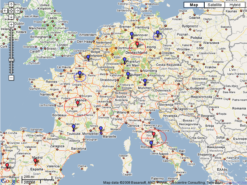
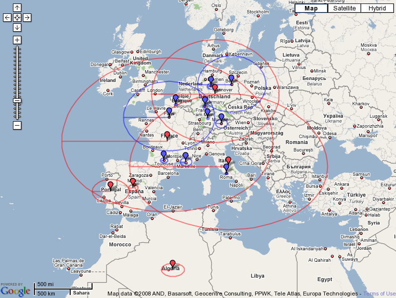
In this prototype, I used Google build in options for drawing lines and polylines. To communicate size of the set being presented, the map presents cicrcle with radius lineary dependant on the number of items in the set.
Formula: radius = const + 0.01 * count
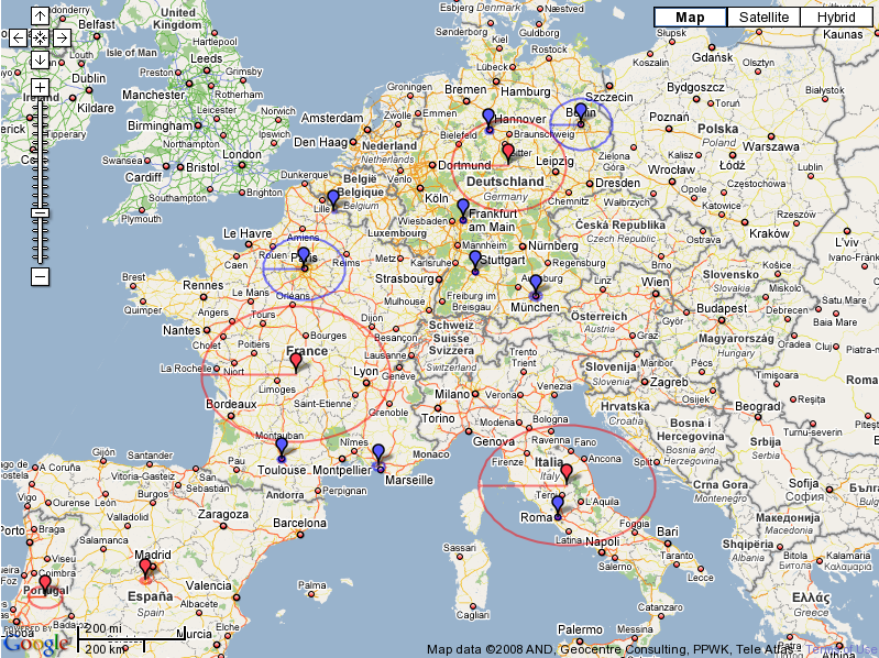
Formula: radius = const + 0.02 * count
Formula: radius = const + 0.05 * count
Here, the size of the circles introduced high visual noise. This also illustrates the need for tuning parameters to avoid visula noise.
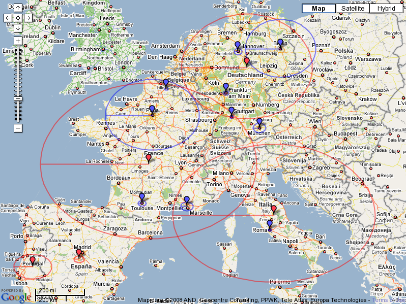
Formula: radius = const + 0.10 * count
Here, the size of the circles introduced high visual noise.
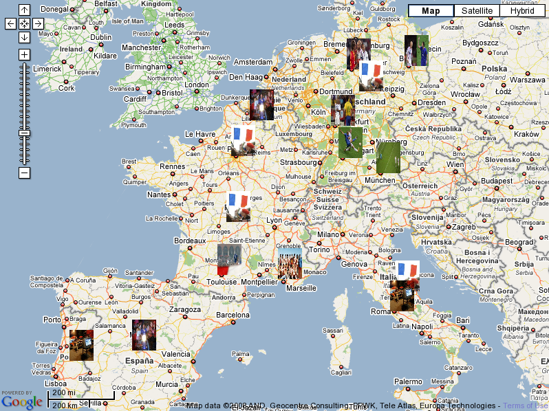
Here, I just used the first image from the result set as an icon. I expected that it will be completely nonsense, but surprisengly there it does not look that bad, and there are two very important properties of this presentation:
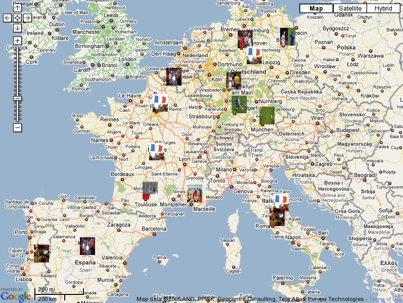
Just different size of images/icons.
Based on Google Charts API. Here the icon is a chart generated by data, in this case the number of items.
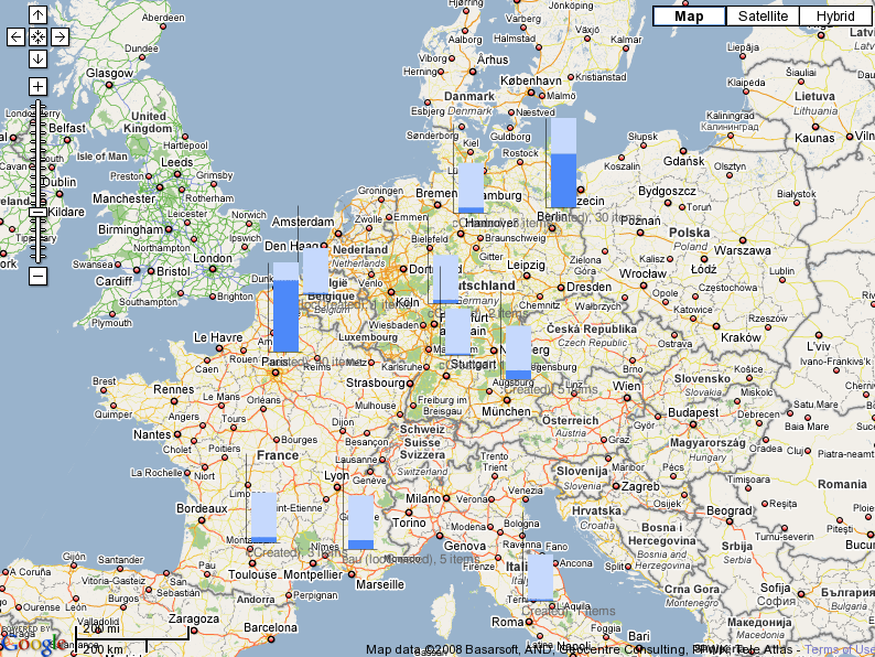
Just different version of charts.
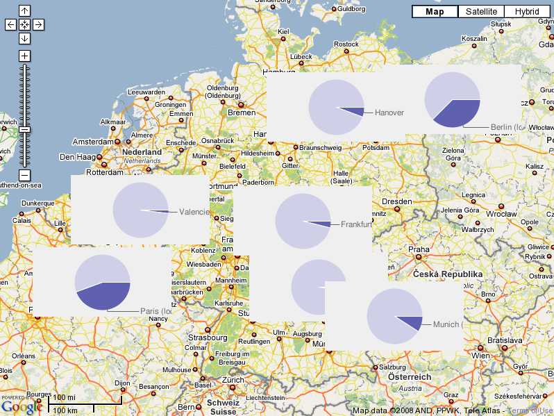
Again using Google Chart API. Can also be used as secondary image to communicate context, i.e. to roughly communicate number of items per country.