Issue
Article
Vol.28 No.4, October 1996
Article
Issue
Issue |
Article |
Vol.28 No.4, October 1996 |
Article |
Issue |
Good interface and screen redesign needs a fundamental theory based on philosophical reflections. Only in this way is there a possibility of an accurate theory discussion. This way will also open up the opportunity for computer and information scientists to understand basic principles on designing human-computer interfaces. With such a background they will be able to work with other scientists on the mosaic field of HCI.
In this paper I show a bridge beginning at the one end with philosophical reflections on the term of information, going on with the properties of the information and an evolution of this theory made as a part of my thesis for doctoral degree. The other end of the bridge are empirical investigations on effects of redesigning user interface screens in existing information systems made with ToolBook, WinHelp and Internet HTML. This redesign is based on recommendations made as consequences of the evaluated attributistical understanding of the information. Another consequence presented briefly in this paper are complex changing tools.
Keywords: attributistical information theory, screen redesign recommendations, effects of redesign of existing user interfaces, complex changing tools
The rule of the user interface screen redesign theory presented in this paper is the attributistical understanding of information. Matter only consists of energy -- only energy is provable -- and the structure of the energy in time and space is its information. Energy without information is not possible, nor information without energy. The sentence "Energie ist der graue Beton, aus dem alles gemacht ist." (Energy is the grey concrete from which everything is made.) [Heisenberg - Dub-94, p.10] of the physicist and philosopher Werner Heisenberg is the initial position of the Attributistical Information Theory of Prof. Dr.-Ing Hans-Joachim Dubrau. As a small part of his theory he found six properties of information which are important for this paper:
If we look at these six properties of information we see that all the properties do not stand on themselves. Every property is derivable from another one. For example, if there are no conservation laws, information can be destroyed. By copying information we change this information. By changing information we destroy and create new information because information is everywhere. Each property involves the others. There must be a more basic property, which I found from reading old Greek philosophers.
They saw our reality only as a part of the whole reality. Thales for instance saw our reality as an imagination of elementary particles, as information made of water particles. And these elementary particles are also not reality. They are also imagined, information made of structured energy. And so we can go on to the ground we will never reach. Information is only a part of information and consists of information. Information is recursive.
There are several consequences of this theory. Hans-Joachim Dubrau proposed for instance a reorganization of the System International de l'Unitè (SI). A reorganization of the basis elements from time, space and mass to time, space and energy [SI 1]. He also proposed the sorting of the Bit, Nit and Dit under the proportional quantities of the SI [SI 2]. But this is not the place to discuss the SI. In the following I want to present the consequences of the Evaluated Attributistical Information Theory for common information systems and for the redesign of existing user interface screens.
Information is recursive. All information carriers are interchangeable. Every user prefers several kinds of information transfer in both directions, system to user and user to system. So they all must be changeable by the user. A good example are the possibilities under WinWord 2.0b. Here the user can remove every one of the screen objects. The user also can redefine the menu and the toolbar and the underlying functions. However, it is not possible to redesign the icons, the status line, the menu position and so on. But let's go on.
Every composition of information indicates other more complex information. If users want to change single objects of a complex, they want to change, often unconsciously, the information transferred by this complex. So users of common information systems need complex changing tools.
A simple example of a complex changing tool is the color box under Windows 3.0. Unfortunately the available color compositions are randomly created and can only be chosen through text information. Users often use the single color selection tool and do not create color composition according to ergonomic and color-theoretical principles. At this moment I am investigating the preferences of users working with this color box.
As a consequence of the evaluated Attributistical Information Theory for the redesign of existing user interface screens, I want to present the following four recommendations a redesigner should take into consideration. If possible I will underpin them with short examples.
This is not new. An old example are the experiments by T. S. Tullis (Figure 1).
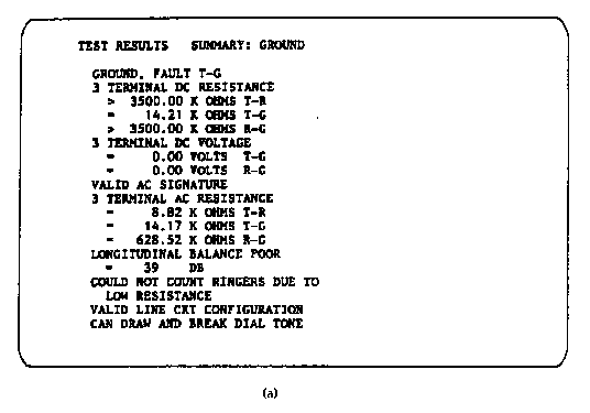
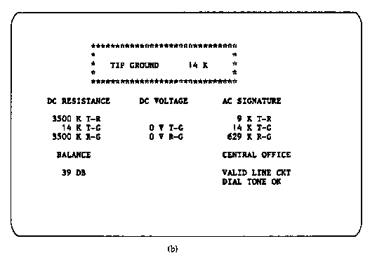
By local grouping, with this design T. S. Tullis reduced the information search time from 8.3 to 5.0 seconds. Attributistically spoken he made the information of sensor units available by structuring the information carriers on the screen. Classically spoken he grouped information.
On the first screen in Figure 1 the user has to create the sensor information by mentally grouping the information carriers. On the second screen the sensor information is reformed by a local structure of the information carriers. To reduce cognitive load we have to reduce the information which had to be created by the user. To do this we had to make the information available in such a direct way. We can find such examples everywhere: border lines group some information, other information is grouped by color or brightness and so on.
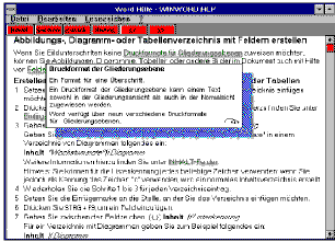
All these possibilities are in use today, but an old one we have forgotten is the verse. In history you can find many examples of using verses to tell scientific knowledge, for instance of the Roman Lucretius and the Chinese Laotse. They wrote in verse with a strong metre.
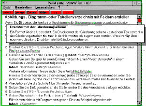
This can be demonstrated with the WinHelp for WinWord 2.0b. The original help is shown in Figure 2. The first redesign using verses is shown in Figure 3.
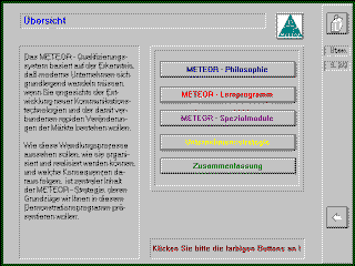
This is also not new. In advertising for instance you can find many examples of using colors or forms to transfer more information than the viewer sees at first. Such information may also be used in screen design. A simple example was proposed by Peter Brusilovsky [Bru-93, p.355]. Hypertext links should be colored green to support exploring by the user. Another possibility in this way is to color screen objects like children's toys to invoke the user's play instinct. An example is the Meteor information system, shown in Figure 4, where the text on the buttons are in different colors.
The resolution of icons and graphics transfer information as well; artistic quality, too, as we can see in the pictures in Figure 5.
Figure 5: Bad Centered Head Lines, and the Redesigned Version
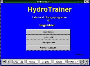
But this is not new. I want to give another example of information: information carriers can also be forms. In one of my last redesigns, shown in Figure 6, I found objects on the screen which are changeable by the user.
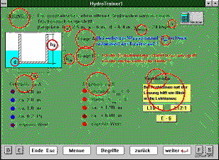
It was even possible to change the answer messages if a user had entered a result!
There is no other reason for such interactivity than author's error. The effect is great. If users notice this, which is likely because this is an interactive page, they will also notice that this page and also the information system is not accurate and reliably created. It is the same effect a snowball has when thrown on a roof.
This means that every change in a information structure is a very complex process. In the redesign of a user interface screen it is sometimes too complex to explain this to other people. It is like art. And a interface redesigner has to be very careful if redesigning an existing information system. One aim of redesigning must be to keep the character of the original information system.
By destroying or adding information carriers the complex information is also changed or destroyed. And some information carriers could become redundant and have to be removed. In Figure 4 there is a very simple example of this.
The information system designer has chosen blue as the color of the first heading in order to increase the differences between the chapters. Later the designer chose another way to differ chapters from each other: by icons. But this change was not made strictly. The blue text should have been changed back to black because there is no reason for it anymore. Blue is not the way to differentiate one chapter from the other. Blue is not the standard color for headlines in information systems. Standard is the division number or character brightness or the localization. Blue also doesn't look very nice here. Blue is also not the standard color of the company.... All in all, the blue color in the heading transfers redundant information because there is no reason for it. It is like white noise on the radio and charges the user's mind.
A good example of this are the little yellow fields under Borland Delphi created as an object property also created under ToolBook as in Figure 7.
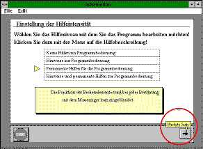
By presenting the information in the environment of the related objects, the designer can reduce cognitive load. Users do not have to store all related information and to remember them later, for instance after browsing a help file.
A more complex example is the initialization of the right mouse button under ToolBook 3.0. By clicking the right button on an object (in Figure 8 on the button "Tutorial") the user can get information about it.
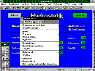
(And here is a little improvement possible, too. Why does the user have to make an explicit mouse click to remove the information window? It is better to use the `mouse leave' message here.)
A bad example is the method of giving help information, shown in Figure 9.
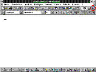
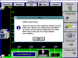
It is not necessary to give such complex information as initial help information. Brief help information is better, so the user can see the related objects. He doesn't have to serve the help information in his mind until he switches between the information system and the help application. Even better would be to initialize the right mouse button like under ToolBook. And after a field leaving message the help information could be removed as a very easy way to go back in the information system. Single Ok-buttons like the one shown in Figure 10 only charge users mind with redundant information transfer and redundant actions. In the short help information field there is also the power of using hypertext to give short and compact information first, with the possibility of getting more detailed information if needed.
The same is possible if you want to give information about chapters showing in a text structure. Information about the contents of the chapters had to be available without switching to another screen.
In my empirical tests I am investigating the effects of interface screen redesign of two ToolBook (one is the above mentioned HydroTrainer), one WinHelp and one Internet-HTML information system. They were redesigned by myself based on the above mentioned information concepts and recommendations. In tests I compare the original with the redesigned version using a questionnaire based on the Protos project [Hol 93]. I use four variables depending on the version of the information system.
When these tests are finished I will be able to present the results.
Dipl.-Inf. Gunter Dubrau
Institut für Softwaretechnik I
Fakultät Informatik
TU Dresden
D - 01062 Dresden, Germany
tel.: +49-351-4575-326
fax: +49-351-4575-336
e-mail:
dubrau@inf.tu-dresden.de
url: http://www.inf.tu-dresden.de/~gd1/gdubrau.htm
Issue |
Article |
Vol.28 No.4, October 1996 |
Article |
Issue |