Issue
Article
Vol.29 No.2, April 1997
Article
Issue
Issue |
Article |
Vol.29 No.2, April 1997 |
Article |
Issue |
Throughout the history of computer use, the interface metaphor has been employed to make computers easier for humans to use. Even the earliest command line interfaces used metaphor. Files and directories were created, deleted, moved, and copied as if they were actual physical objects. With direct-manipulation graphic interfaces, the metaphors become much more obvious and more thought is put into choosing one. In the Macintosh desktop, users select, grab, and drag files and folders on the screen as if they were manipulating actual objects.
But metaphor alone is not enough for effective interface design. There has been much written and taught about choosing and designing the best metaphor for a given job, but for maximized ease of use, no metaphor is sufficient. We need to go beyond metaphor, sometimes even abandoning it, to make our computer systems truly easy to use.
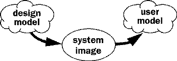
When designing a system, designers develop a conceptual model of it, called the "design model". The development of this model is based on a particular set of users, a particular context of use. It includes things like what features perform what tasks, the navigational structure of the system, and how the parts of the system relate to one another.
As a person uses the system, they form a "user model"; they develop their own concept of what the system's structure is and how it works, based on their experience with the system. Sometimes the user model is an accurate model of the system, sometimes it is not. The designers' goal is to communicate the design model to the user. Their only means of communication, though, is the system image itself. If a system is successfully designed, then the user model will be equivalent to the design model [8].

Figure 1: Communication of the Design Model
Obviously, this communication is critical. It occurs as the user experiences a system's look and feel its metaphor. It is important to realize that the user forms a user model whether or not the designers have made a conscious effort to communicate the design model to them. So there must be an intentional effort made to create and communicate a design model, otherwise we cannot expect users to understand and use a designed system effectively.
Metaphor, as the term is used in interface design, has only a little in common with metaphor in literature. Metaphor in literature is "an implied comparison between two things of unlike nature that yet have something in common" [3]. Both things are known, and the power of metaphor is in an unlikely or surprising pairing. With the pairing, the author tells us something surprising about what we thought we already knew. In a computer interface, one of those things is new and unknown. The power of the metaphor is in making a new system look and act like a known system. Interface metaphors provide the user with a user model directly.
Physical objects, solely by their appearance and physical properties, afford a particular set of functions; a long straight stick has a number of potential uses poking at soft ground, support on rugged terrain, knocking fruit from a branch. On the other hand, screen displays have no inherent functions, and program functionalities have no inherent appearance. For example, an abstract function may need to be invoked by having the user click the mouse pointer in a particular location. The clickable spot can be indicated by a group of colored pixels or by a highly rendered image of a lifelike button. In the latter case, we use a metaphor of a physical button, which has a function and appearance that users are familiar with already; when we apply a metaphor we apply its function and appearance to the screen [4].
Linking a model of a known system and its functions to an unknown program via metaphor allows the user to apply what they know about the one system to the new one. This link applies the user model of the known system to that of the unknown system. Users then make certain assumptions about the new system. For example, they can assume that Macintosh Finder folders can be opened and that objects (files and other folders) can be placed inside of them or removed from them.
Metaphor is a flawed means of communication. Lakoff and Johnson [7] write that metaphor not only emphasizes similarities between two things, but also hides non-similarities. We tend to speak and think of argument as war: we defend our point of view against our opponent's attacks, and form strategies of our own in order to win the argument. But in thinking of argument in this way, we miss out on the aspects that are not like war: it could be a collaborative sharing of ideas benefiting both participants.
So the choice of metaphor has a lot to do with the way we think about things. Computer-based systems are very different from physical systems. So modeling one after a physical analog is bound to bring up inconsistencies and inadequacies. There is not a one-to-one mapping between the system and its real-world analog. The metaphor implies at the same time too much and too little about the system.
Interface metaphor implies that the system has certain attributes that it actually does not. For example, we tend to think of electronic mail as a sealed, private message that will be read only by its recipient, like the mail we send via the postal system. Yet there are no laws protecting email in the same way as physical mail. In fact, it is easy, and not uncommon, for companies to archive and monitor their employees' email. Only very few companies have taken steps to declare personal email a private correspondence between two people. The postal metaphor implies that email has the quality of privacy that it actually does not.
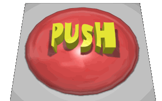
Certain screen elements might cause confusion as well. We see many examples of things that look like buttons, but really are not. Some Web browsers allow text segments to be freely colored, which confuses people since a colored bit of text normally signifies a hyperlink. The Really Big Button That Doesn't Do Anything (http://www.wam.umd.edu/~twoflowr/button.htm) is a wonderful example of a false button. It does absolutely nothing except invite people to press it and submit comments on their non-experience.

Figure 2: The Really Big Button
Metaphor also hides certain existing features of the system. There is nothing in the Macintosh desktop metaphor to imply, for example, that double-clicking on an icon will open the document, that pressing command-option-escape will force the current program to quit, that holding the option key down while switching applications will hide the one you're leaving. The list goes on and on. It is these hidden features that keep manual-writers, "tips" columnists, and user groups in business. It is the knowledge of these features that mark the difference between newbies and oldbies. The model we get from the metaphor limits the way we think about and use the system, until we learn the "secrets". In other words, the system's features, as useful and necessary as they may be, don't fit within the bounds of the metaphor.
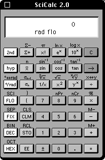
This comes about since computers are capable of so much more than anything in the physical world we can draw an analogy to. We often use computers precisely because they let us do things easily, thoroughly, and quickly that are not possible in the physical world. We get frustrated when our computers begin to act in the inefficient ways that characterize our physical world. Traveling the islands of the game Myst becomes tedious as our virtual travel takes nearly as long as it might in real life. Calculators and CD players often have interfaces that look a little too much like their physical counterparts. Some on-screen calculators go so far as to include an "alt" key for alternative functions, thus making it as hard to use as a real calculator.
It is the "magic" of the interface that allows us to quickly and completely erase marks from our Photoshop document, get information from a database on the other side of the world, and put movies into textbooks. The computer frees us to do tasks impossible in the physical world. A real-world metaphor, though, supplies us with only a "real world" user model.
These two problems combined can imply that there is a particular way of performing tasks. We may be likely to want to use the habits we've developed to work with the metaphoric system while working on the new system. A friend-of-a-friend, new to computers, repeatedly hit the delete key to move back to previous sentences in a word processor. It didn't occur to them to set the cursor to the desired place using the mouse, or to select a range of text for deletion with the mouse. They continued to use the computer as they had always used a typewriter. Similarly, we might drag a disk to the trashcan for the first time with some hesitation, since putting things in the trash is the way that we get rid of them in our physical world. By working with a system that looks like something we're so familiar with, we apply our old habits to the new system.

Figure 3: The Over-Literal Calculator
James Gibson [6] coined the term affordances to refer to the properties of an environment that allow creatures to function in that environment. He defines affordance as "a specific combination of the properties of [a thing's] substance and its surfaces taken with reference to an animal". For example, if a surface is large enough, solid enough, level enough, and smooth enough, all relative to a particular creature, it affords "walk-on-ability". If another surface is solid, level, and smooth enough, and is situated at knee-height to an upright biped, it affords "sit-on-ability". At the same time, though, it affords "bump-into-ability" and "crawl-under-ability".
When designing objects cups, homes, cars, etc. affordances must be carefully considered as the properties of the object are created [8]. The cup handle must fit the hand, its rim must fit the lip, its weight and balance must feel right. Affordances become the means of communicating the design model to the user. For example, a handle on a door affords grasping and pulling. A flat plate on a door affords pushing. When affordances are designed improperly or ignored altogether, then the object communicates the wrong messages to its users; people push on doors that they should pull.
Computer interfaces are designed objects as well, so their affordances must also be carefully designed [5]. Since our physical interactions with most computer systems are limited (a flat visual display, a mouse sliding over a table-top, a mouse button or two to press, and a limited set of sounds), the design of interface affordances are even more important.
On-screen buttons afford clicking, but do not afford moving or modifying. Icons (files and folders) in the Macintosh Finder, if we recognize them as "things", afford clicking, dragging, and dropping. Scrolling text fields afford the reading of long texts, since they generally have a large text area and a scrollbar for navigation within the text [4].
Although affordances exist independently of their being perceived, if the communication with the user is to be successful, the affordance must be made apparent. It is much like Kenneth Burke's definition of form: an "arousing and fulfillment of desires" [2]. Affordances perceived arouse an expectation, a desire, in the user. Their resulting action must fulfill that desire, or frustration builds.

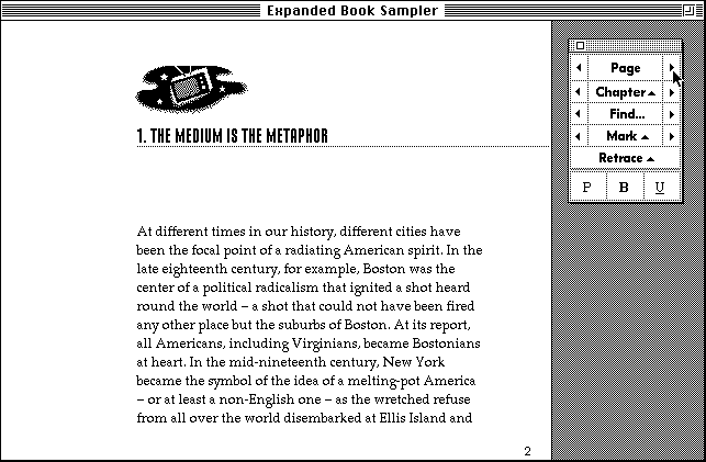
Figure 4: Example of the Book Metaphor
We can readily see the relationship between metaphor and affordance. When a metaphor is applied to a system, it gives the system a particular set of affordances. Metaphor is a container for a particular set of affordances. The book metaphor includes a set of affordances, including those for page-turning, reading text, bookmarking, and so on. The blank sheet of paper metaphor affords marking and erasing, and so on.
When we create an interface metaphor, we are, in essence, dumping the contents of the metaphor (its affordance set) onto the computer system. Some of those affordances fit nicely onto the system's feature set (else that metaphor would not have been chosen), others do not have a corresponding feature in the system, and some of the system's features are left affordance-less, invisible.
The set of affordances that ends up in an interface if we stop after choosing the metaphor includes wrong affordances those that imply nonexistent features and does not include those that need to be there to communicate other important features in the system. To make interfaces communicate exactly the appropriate model, we need to manipulate this set of affordances. The metaphor provides us a good starting place, but we need to remove the affordances for nonexistent features, and add affordances for features that exist, but don't fit into the metaphor.
The best, most successful, interfaces go beyond metaphor. Computer systems are, if not better, then at least much different than physical systems; they are systems where magic exists; they are systems that let us do things we can't do in the world of physical laws; they are systems that afford the impossible.
Photoshop's blank sheet of paper has layers that allow us to create and combine images effortlessly and without committing to our marks. That paper is also so easy to erase that we are free to mark at will, visually playing and exploring. The analogy to canvas and brush, paper and pen, and photographic paper are nearly gone. The Macintosh desktop has file-gobbling folders, scrolling windows and a metal trash can floating on it. It is not anything like the physical desktop I have. Books on CD-ROM include elements impossible to find in traditional books: a find feature, video and sound clips, links to other pages, and so on.
Metaphor is good as a stage of design, suggesting to us what features might be appropriate in the system or supplying us with a stepping-off point for the look and behavior of the interface. But we need to get beyond the metaphor, even allowing the system to grow to where it no longer resembles that original metaphor at all.
Affordances only have meaning when considered with respect to a particular group of users. The front door to your home affords passage to you and your family, but not to a giraffe. A grade school desk affords sitting to a child, but not to an adult. This article affords reading only to people who read English and have enough motivation to continue reading. Affordances must be designed with the user in mind.
The rhetorician Wayne Booth [1] emphasizes that a balance of audience, creator, and content must be maintained in designing a successful communication. The communication between an interface designer and a user through a designed system is no different. The user determines what material may be presented, and how it is to be presented. The creator is the voice used. The form of the content changes as voice and audience are defined. Consider the differences between teaching geography to children, teaching a new policy to employees, and teaching art students how to throw pots on the wheel.
Physical capabilities, cultural and social background, language, skill levels, work environment, education level, etc. must all be considered when choosing how to communicate the design model through affordances. Knowing the context of use for our system comes about through research prior to development, and usability testing throughout the process.
Although applying an interface metaphor can be an effective way to begin designing a system for ease of understanding and use, it is not the metaphor itself that makes a system successful. What makes a system successful is how well the design model is communicated to the user. This is accomplished through the interface's affordances, at a lower level than metaphor. Understanding affordances allows us to fine-tune interfaces by increasing or decreasing emphasis on perceptual cues for functions that do or do not exist.
While metaphor is a useful way of providing consistency and structure, and of providing an initial set of functions and affordances to work with, we need to be bold when it comes to breaking from the metaphor when necessary when the interface needs to perform in a manner inconsistent with the metaphor. It is there, in those instances when we escape from a metaphor that has become too restrictive, that innovative interfaces are born by careful manipulation of the system's affordances.
Realizing that affordances communicate the design model encourages designers to evaluate a system in terms of the functions it makes clear to its users. It allows designers to emphasize important functions and downplay unimportant or nonexistent ones, regardless of how those functions or appearances fit within a metaphor. Being aware of the limits of metaphor and how affordances communicate will make our interface designs clearer and more intuitive.
[1] Booth, Wayne. Now Don't Try to Reason with Me. Chicago: University of Chicago Press, 1970.
[2] Burke, K. "The Nature of Form." In Contemporary Rhetoric: A conceptual background with readings. Edited by R. Winterowd. NY: Harcourt Brace Jovanovich, 1975.
[3] Corbett, E., Classical Rhetortic for the Modern Student. Oxford: Oxford University Press,1990.
[4] Gaver, William. "Oh What a Tangled Web We Weave: Metaphor and Mapping in Graphical Interfaces." In Proceedings of the CHI '95 Conference on Computer and Human Interaction. NY: ACM, 1995.
[5] Gaver, William. "Technological Affordances." In Proceedings of the CHI'91 Conference on Computer and Human Interaction. NY: ACM, 1991.
[6] Gibson, James J. The Ecological Approach to Visual Perception. Boston: Houghton Mifflin, 1979.
[7] Lakoff, George and Mark Johnson. Metaphors We Live By. Chicago: University of Chicago Press, 1980.
[8] Norman, Donald A. The Psychology of Everyday Things. NY: Basic Books, 1988.
Ken Mohnkern is webmaster and multimedia designer for the School of Computer Science at Carnegie Mellon University, and a graduate student in Interaction Design. He can be reached at Department of Design, Carnegie Mellon University, Pittsburgh, PA 15213, U.S.A.mohnkern@cmu.edu
Visual Interaction Design is a Special Interest Area of SIGCHI focusing on the visual aspects of interaction in interface design.
The goals of the Visual Interaction Design Special Interest Area are to act as a focal point for visual interaction design interest within SIGCHI, to advance visual interaction design as an integral component of HCI, and to integrate visual interaction design with the rest of SIGCHI.
To contribute information to this column, send email to sf34+@andrew.cmu.edu or fmmarchak@tasc.com, or write to Shannon Ford, Department of Design, Carnegie Mellon University, Pittsburgh, PA 15213, U.S.A. or Frank M. Marchak, TASC, 55 Walkers Brook Drive, Reading, MA 01867, U.S.A.
To subscribe to the Visual Interaction Design ListServ group, send email to LISTSERV@VTVM1.CC.VT.EDU with the single line:
subscribe VISUAL-L <your name>
in the body. To unsubscribe, send mail to the same address with the single line:
signoff VISUAL-L
in the body. To communicate with members of the Visual Interaction Design community, send email to visual-l@vtvm1.cc.vt.edu.
You can also access the list via bboard: internet.computing.visual-l
Issue |
Article |
Vol.29 No.2, April 1997 |
Article |
Issue |