Issue
Article
Vol.29 No.4, October 1997
Article
Issue
Issue |
Article |
Vol.29 No.4, October 1997 |
Article |
Issue |

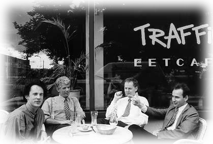
What is the essence of user interface design? What is the one project that is the quintessential `design for use' problem? If you were to ask me that (and as yet no one has ever done so) I would reply that it is the design of a good café. This is a subject that I have spent many hours contemplating and discussing. Mainly because the only time I have free to contemplate and discuss is when I am sitting at a café.
A good café with a terrace (sitting at tables outside) is a combination of a number of key elements. One of the main ones is the division of space into busy and relaxed areas. The area of the café and the terrace should have a definite feel of relaxedness and unhurriedness, while the adjoining area, the street, square whatever outside should be thronging with life, and by thronging with life I mean people, bicycles, shops etc, I don't mean cars and lorries. This division should be quite pronounced and sharp, business happening a couple of hundred meters away is wasted, the closer the better as long as the calm of the terrace is not affected.
The nature of the `busyness' being observed is also important, people just walking past is not really too interesting. It is better to have a café and terrace facing some sort of `happening zone' such as a junk market, a junctions of roads, a collection of local shops or even an area with paid parking where people aren't paying.
In non-ideal weather conditions coziness is king. In the early summer months I have seen terraces with heaters to take the edge off the chill and my favorite combination is to be on a covered terrace on a warm day during a summer rainstorm, just watching people scuttling about while sipping a hot cappuccino, I love it!
All the references to busyness and activity may lead you to think of cafés in the midst of city centers, but there must be a balance, the designed edges of the environment must be offset and softened by nature, some fine old trees, or some grass and shrubs. Even large potted plants make a difference. My theory is that the incredible detail and structure in nature is somehow visually restful. Far more so that a bland stretch of concrete. Your average tree has infinitely more detail than any man-made structure and the eye somehow knows this and can relax into it (I know I can spend hours staring at the natural forms of the flames in a good log fire but I get quickly board when gazing at the central heating fittings). Furthermore with cafés that are visited regularly the presence of nature accentuates the awareness of the seasons which is also (for some unfathomable reason) important.
Personal comfort in a café is influenced by the environment and the more direct the contact with the environment the more of an influence it can have. The most direct part of the environment is the table and chairs at which you sit. Those trendy chairs with the uneven chair back look wonderful, until you try and hang your jacket over them, it seems to hang fine but as soon as your back is turned the jacket is somehow jettisoned onto the café floor.
Worse than trendy chairs are wobbly tables. If the wobble is not too severe and there are beer mats on hand then it can actually be positive, guests can level the wobble by jamming beer mats under the legs giving them a warm feeling of configuring their own environment. If however the table has all feet firmly on the floor and the wobble is in the table itself it can be terrible, as you shift and lean the table jerks from side to side, never actually spilling anything but completely ruining any feeling of calm built up by all the other factors. A plentiful supply of beer mats with one side blank is also a useful aid for technical discussions. Richard Bird once said that to be a good mathematician you must posses the ability to write upside-down on damp beer mats.
The feeling of being pampered is a more tenuous part of the overall atmosphere, this feeling stems directly from the staff that are waiting on you; their attitude and manner and the way in which your order is presented by them, the neat cup of cappuccino with its accompanying biscuit, sugar and spoon, delicious croissant warmed and served with a serviette, butter and jam. Evening liquors served with all the right accompaniments. Pure heaven!
Finally, If anyone knows of grant awarding bodies willing to sponsor further field research in this area I would be delighted to hear about them.
Lon Barfield
Lon Barfield is the author of `The User Interface, Concepts and Design' (Addison Wesley) and is an associate director of General Design (http://www.design.nl/). He can be contacted at lon@design.nl.
Issue |
Article |
Vol.29 No.4, October 1997 |
Article |
Issue |