Figure 1: An Example Web Page
CWI, Kruislaan 413, 1098 SJ Amsterdam
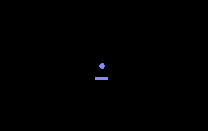
Just to make clear what this is, it is a page with a black background; the only other element is in the middle, where you see a blue underlined full-stop. This blue underlined full-stop is in fact a link to the real information that you actually wanted when you visited this page.
This is probably a cool site. Unfortunately, it is difficult be sure, since it doesn't carry any of the logos granted by the self-chosen arbiters of all that is cool on the web (Figure 2). Including one of the logos would of course spoil the minimal starkness of the page design, and so we are left guessing.
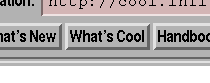


Figure 2: Arbiters of All That's Cool
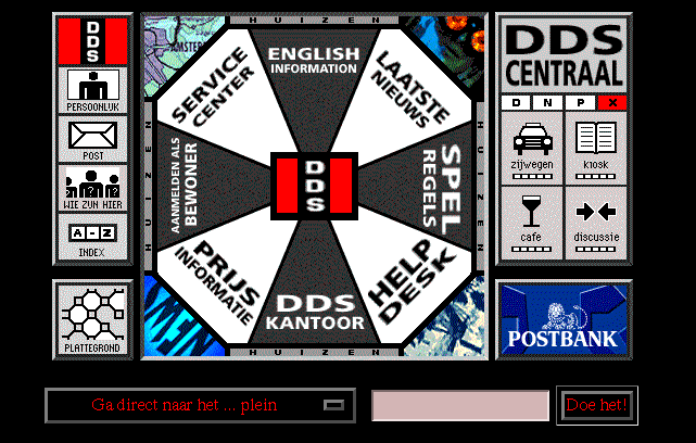
Consider now the Web site in Figure 3. This is the initial page of De Digitale Stad, a well-known Dutch web site. The problem with this site is that even if you know what you are looking for, it can be extremely hard to find. If you don't know what you are looking for, then you're in great trouble. One of the elements on this page is marked Spel Regels (Rules of the game) which seems to suggest that the designers thought of it more as a game than an information site.
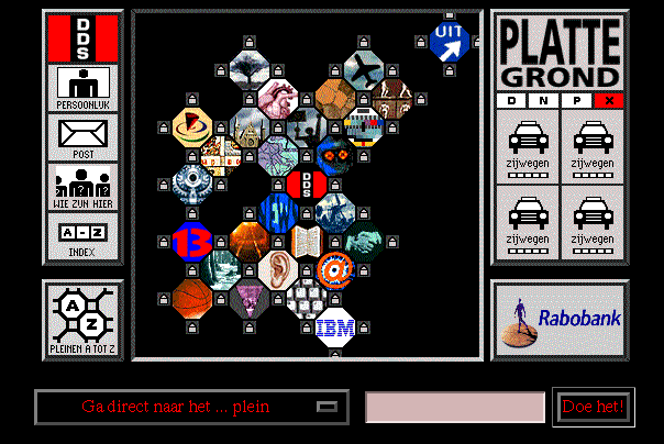
Luckily (at first sight) there is also a button marked plattegrond (map), which suggests may be a helpful tool in getting aroung the site. Unfortunately, pressing it, gets the page in Figure 4, which leaves the user just as lost.
On this page, though, there is a button marked Pleinen A-Z (Squares A-Z), and clicking that gives you the page in Figure 5. This immediately gives you the information you need about what is available, and finding information from here is easy.
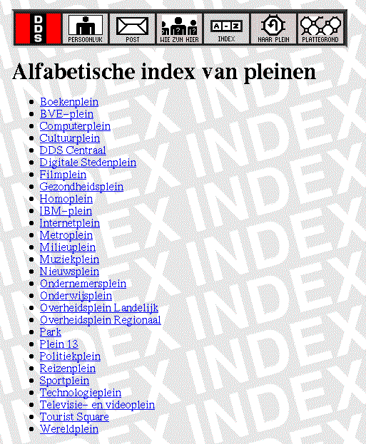
Figure 5: A List of the Pages on a
Web Site
The problem is, web pages are a human-computer interface, and they should be designed like one, with task and requirements analysis, user testing, and iterative design. Unfortunately, everyone thinks they can design a good user-interface, but few people really can!
The World Wide Web currently seems to be dominated by the question "What's Cool". Too many WWW documents emphasise cool graphics (with their concomitant long download times) to the detriment of quality of content and usability. It was this problem that was one of the many that SIGCHI addressed when it decided to put its main publication, the SIGCHI Bulletin, online on the web: the real question should be not "What's Cool", but "What's Good".
Although the Bulletin is produced almost entirely by volunteers, and produced on a rather low budget (in order to keep its price as low as possible for members), it attempts to be a high-quality publication; for instance, it is entirely typeset, rather than being produced from camera-ready copy supplied by the authors.
The SIGCHI Bulletin is produced entirely electronically. Material is submitted by editors and authors electronically in a number of different formats (ASCII, Word, TeX, Frame, and others), via a number of different routes (email, ftp, floppy disk), and the Bulletin is laid out and typeset electronically in the Netherlands. Finally camera-ready copy is produced on a 2400 dpi digital typesetter, and sent to the printers in the United States.
SIGCHI is an active, vibrant and forward-looking SIG, and considers it important to be at the forefront of developments in electronic publishing. As a consequence, it is supporting a number of experiments in electronic publishing, such as producing CD ROM and World Wide Web versions of the proceedings of its annual CHI conference [5].
Another of these experiments was to produce a pilot electronic issue of the SIGCHI Bulletin, to be accessible via the World Wide Web. The experiment aimed to find out how much work was involved in producing an issue, what resources were needed, and in keeping with the primary aims of SIGCHI – Computer Human Interaction – what is necessary to make using an electronic journal as pleasurable as possible, with an aim to begin publishing the Bulletin simultaneously on paper and electronically.
Some of these complaints will disappear soon enough, and are only a function of technical constraints. Colour LCD displays of 300 dpi are already being made [6], and only have to drop in price to be usable on a large scale. It is easy enough to envisage a device the size of a paperback book with a display of a quality barely distinguishable from the printed page, using current or soon-to-be available technology.
However, there are advantages of a paper publication that are inherent in the medium: for instance you can see at a glance how big a publication is and it is easy to quickly scan through to get an idea of the contents.
On the other side of this coin are the undeniable advantages of an electronic publication, such as the ability to cross-link, and the ease of searching – and that the use of colour is effectively free.
So we approached the design of an electronic SIGCHI Bulletin with a central question: how do you make reading the Bulletin online as pleasurable as possible and what can be done to make the perceived disadvantages more acceptable?
It is important that any electronic publication support all these modes of access, and not give priority to any one of them to the detriment of the others.
The purpose of browsing, either an issue or an article, is to quickly get an idea of the size and content, so it should be easy to skim through an issue, and if possible with one glance get a feeling for the content of each article.
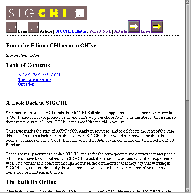
On the other hand, if someone wants to read an issue serially, it should be as easy as possible, without too many extra actions. An especially important point is that when reading an article the reader should never get lost and wonder where they are or how to get back – a well-known phenomenon in hypertext systems [7], [8]. There are many documents on the Web that are split into many little pages so that the reader quickly loses track of the organisation of the whole. For instance the default action of the package Latex2Html [2], [3] which converts Latex documents to HTML, is to split an article so that each section is a separate HTML document. A single document then becomes a network of cross links. Figure 6 shows an example of such an article, and Figure 7 a section from such an article. Readers are at a loss where they are, and how to get anywhere. Any section you are reading is isolated from its context.
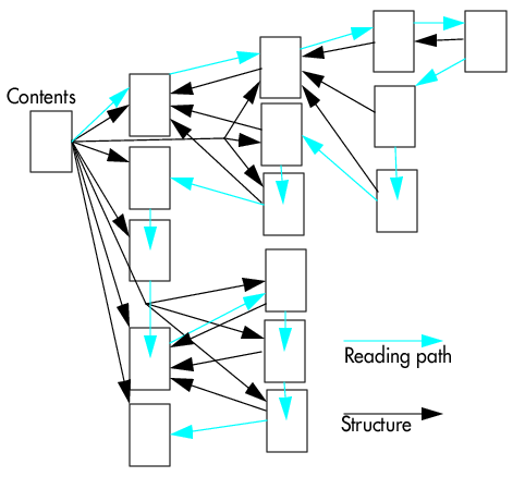
Figure 6: A Latex Document Converted to HTML
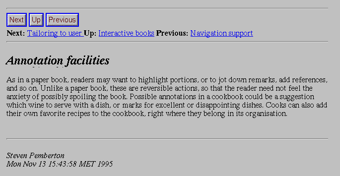
Figure 7: A Section from a Converted Latex Document
This should be avoided, at the article level, but in general terms for the whole site as well.
Consider the page in Figure 8, which is a description of how to travel to a research institute near Paris. It has been split up into several parts, how to travel to Paris from the airports, how to travel from Paris to Versailles, how to travel from Versailles to the institute. Each of these sub-descriptions are themselves split into several sub-pages, each describing a part of the journey.
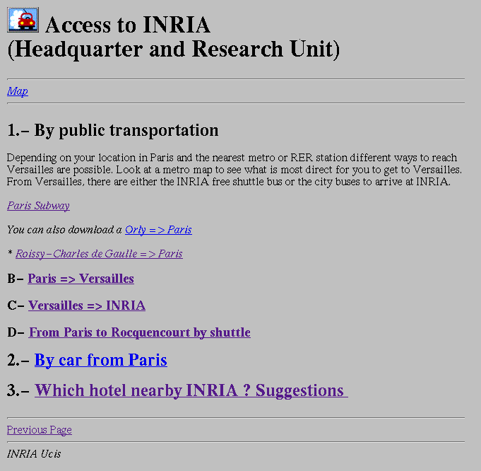
Figure 8: Travelling Somewhere
But the fact of the matter is, the user of this information will nearly never want this information when sitting behind a computer screen. More likely will be that they have just stepped out of the plane at the airport and want to know where to go next. That means that the user of this information has to visit each of the subpages in turn, and print them out, then reassemble them into a pack of paper, and take that with them.
While this point isn't so essential for an online publication, where the reader will often just browse articles online, it should also be easy to print an article out, so that the reader can take it to read in the train. Splitting articles into small pieces makes this difficult.
A reader should be able to easily jump between issues, for instance to follow a thread; it should be easy to read all the Education columns from all the issues, for instance.
And finally, the reader should always be aware that they are reading the SIGCHI Bulletin, wherever they come from. An author may put a pointer to an article from their own home page, or as a reference from another article; following that should make it clear to the reader that they have come to the SIGCHI Bulletin, and that there is a structure involved. (Related to this, a page should never contain a link that says "Back to Home Page" or similar, since in the case that the reader has come from a different route than envisaged by the designer of the page: following that link may have a different effect than that expected by the reader.)
An immediate advantage of this structure is that it is shallow: this reduces the chance of the reader getting lost, since the hierarchy exactly reflects the conceptual structure of a journal (series of issues, each issue of a series of articles, and no further subdivisions, although there is a structure imposed within each article).
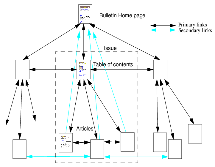
Figure 9: SIGCHI Bulletin Global Structure
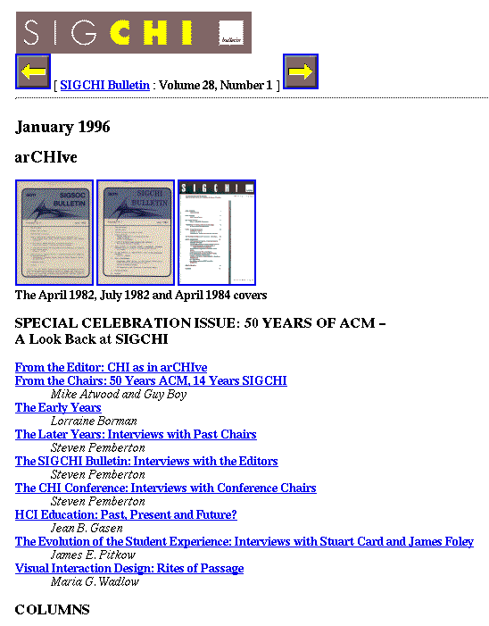
Figure 11: An Issue's Table of Contents
Below these headers is a list of links to the individual articles, and then at the bottom a repeat of the links in the header: these are above all to aid serial scanning – you are searching for an article, so you go to the first issue, scan that (which may involve scrolling if it doesn't fit on the screen), and then you can immediately go to the following issue without first going back to the top of the page.
Each article has a banner to identify the article's source, especially important for people who have reached it through a different route than the Bulletin's home page. Using the information that needs to be there anyway (name of publication, identification of issue date) there are links to the Bulletin home page, and the table of contents for the issue that the article is for (without the use of the words "Back to...").
Additionally there are links to the previous and next article in this issue, to make quick scanning through an issue easy. Finally, before coming to the article proper, there is a table of contents of the article as a nested list of hyperlinks of the headings of the article, making accessing subparts of an article easier.
A reader can then quickly scan through an issue, looking at the table of contents of each article, using the slider at the edge of the window to get an idea of how long the article is, to quickly get an overview of an issue.
Also in the header are links to the same article in the previous and next issue, should there be such things. So should anyone feel inclined to read all articles from the editor, for instance, they can quickly click from issue to issue.
Finally, as with the issue tables of contents, at the end of the article the links in the header are repeated: again to aid the serial reader, who can quickly and easily get to the next article, or to the issue's table of contents.
This article was originally published in the CWI Quarterly, Volume 8, Number 4, December 1995.