Issue
Article
Vol.27 No.3, July 1995
Article
Issue
Issue |
Article |
Vol.27 No.3, July 1995 |
Article |
Issue |
Lon Barfield
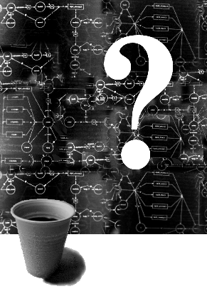
Anyway, user interface designers run on coffee machines: at any gathering revolving around user interface design huge discussions arise while interacting with everything from the light switches to the vending machines. A few months ago I was giving a series of lectures on simple user interface design. During the day drinks breaks were scheduled in and we would gather round the incredibly complex vending machine, where the topic that I had just been dealing with would be brilliantly illustrated, usually by the bad design of the machine. It incorporated hot-drinks, chocolate bars and LCD screens providing huge amounts of information to the user and it all worked with cash cards. There was a built in machine where you could buy a cash-card and feed coins in to have your cash-card charged with money, or you could return your cash-card and get the leftover cash back.
One of the subjects I covered in the talk was feedback. During the coffee break we discussed how the machine was a corporate model, meaning that it looked like a corporate headquarters; smooth, smoked glass unbroken by buttons or text. The controls were touch sensitive areas hardly distinguishable from the rest of the machine. In the afternoon session I explained that too much unnecessary feedback was a bad thing. In the break we saw that the LCD screen of the vending machine supplied screen-full after screen-full for every key press. No wonder the queues moved so slowly.
I talked about user configuration of systems, how it should be simple. During the coffee break one of the researchers who worked there told me that the cards could be programmed with your choice so that all you had to do was stick the card in and it would give you the drink and deduct the cash from your card. He also said that when the machines were introduced the staff had to have a three week course in using them. The machines were so complex that I didn't realise he was joking.
Funnily enough this mention of programming the cards explained why the cash-card I had bought from the machine always insisted on giving me a cappuccino. The previous user had programmed it and somehow the programming had remained on it for the next confused recipient; me! It was lucky that cappuccino was also my choice since I had no idea how to reprogram it. This observation tied nicely in with the section of my talk about the problems of building defaults into interactive systems.
Also during the talk I dealt with the disadvantages of designing an interactive system so that the user has to perform many actions in order to reach a particular goal. Later, in the coffee break, I tried to buy a bar of chocolate from the vending machine. The chocolate was all on show, arranged in a grid behind glass, and each choice was numbered according to the row and column it was in, thus a Mars-bar was 25 (row 2 column 5), a Bounty was 26 and so on. The interaction actually involved to get a Mars bar was more complex. I first had to type a 2 in to select the row and then the LCD screen told me what was in that row (even though it was plainly visible behind the glass). I could then type the second number in to select from that row. Fine, selection made, I thought. But no! Once I had actually chosen the chocolate bar, the LCD screen informed me that I then had to press the START button to actually get the machine to give the chocolate to me. What else was it expecting me to do with the choice I had made? Delete it? Move it? Three interactions to make one choice: not good.
Clever user interface designers will now be pointing out that I didn't need to deal with the actual choice as two digits, if I had just keyed 25 in as a two digit group I would have chosen a Mars bar in one step instead of two and been unaware of the fact that the choice was made up of two actions. However, I thought of this at the time and tried it, only to discover that after typing in the first digit there was a short `dead-time' while the machine processed this and altered the LCD screen contents. During this `dead-time' it didn't register the second digit.
The presence of that particular vending machine next to the room where I was giving the course was quite a coincidence, but even without coincidences our daily lives are strewn with interactive products, everything from cat-flaps to CADCAM systems. A good user interface designer is always a good user interface designer, even when she is making a phone call, interacting with a ticket machine or buying a cup of coffee from a hot drinks vending machine. This awareness of real-world user interfaces plays an even greater role if she teaches user interface design: she should always be filing away examples to be used to illustrate good or bad user interface design in a way that everyone can appreciate and empathise with. But still, now that I think about it, that machine may have had a complex and confusing user interface, but it did actually make a good cup of coffee!
Issue |
Article |
Vol.27 No.3, July 1995 |
Article |
Issue |