Issue
Article
Vol.27 No.4, October 1995
Article
Issue
Issue |
Article |
Vol.27 No.4, October 1995 |
Article |
Issue |

"I've done it Cinderella" "Oh Buttons! You do so many things for me, what a pity there's only one of you"
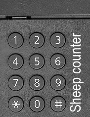
62... 63... 64... What am I doing? 65... 66... 67... Counting sheep? No. 68... 69... 70... No such luck. I'm at work. 71... 72... 73... 74... 75... New printer. 76... 77... 78... 79... You can attach it to the Ethernet and send the print jobs to it over the net. Bril! 80... 81... 82... But first you have to program the IP number in, (the Ethernet address). 83... 84... 85... There's a clever menu structure, you use one button to step through the menus and another to step through the choices in each menu 86... 87... 88... and a third button to select the menu option and do it. 89... 90... 91... But for the Ethernet address you then have to program the digits in and there isn't a numeric key pad. For each byte in the address you have to start from 1 and then press the next button to get 2 and then next again and so on. 93... 94... 95... The address is 195.78.77.120. Thank goodness I only have to do it once!
15... 16... 17... Now what am I doing? No, it's not the second byte. I finished them all. It took ages! So what am I doing now? 18... 19... 20... Well it turns out that when you've reached the number you want for the byte, you have to press the enter button before going on to the next, otherwise it ignores your changes. 21... 22... 23... So I stepped through setting each byte and when I'd finished them I checked the address and it was 000.00.00.000! When I have finally finished (assuming nothing else goes wrong), I'll have pressed that stupid button about a thousand times, I can already feel RSI setting in...
In the hi-fi world there is a trend among manufacturers for as many knobs and buttons as possible. In other sectors of the electronics market they try and get by with as few buttons as possible. How often have you programmed the time into a digital alarm clock where there is a fast forward button but no reverse button? The time whizzes past, and Whoops! you miss the setting you wanted and have to go right round the clock again.
Less buttons is not, by definition, a bad idea. If a system is well designed and comprehensive then a small number of buttons can be wonderful. The key phrase there is well designed, but most companies are not motivated by good design. The drive towards as few buttons as possible is motivated by the cost of building buttons into equipment, the lack of extra space for buttons and labels and the increased maintenance and decreased life-time that come with extra moving parts. It certainly has little to do with a drive towards simplicity and ease of use! Indeed the lack of good design means that button deficiency leads to several detrimental effects:
1: Some actions take a long time due to using a button with a general simple functionality to achieve a complex goal.
2: Some actions do not have a suitable undo like the alarm clock mentioned above.
3: Some buttons have different actions in different contexts (modes) leading to errors. Don Norman cites a digital watch where the button to illuminate the display also functions (in stop-watch mode) as a reset button. A boggling night-mare for night-time joggers!
An interesting side-effect of button limitations is that as well as cramming all the user functions into a small set of buttons the designers also have to cram the maintenance, testing and demo functions in to the same set, hiding them in strange multi-key combinations. Try this at home, or at work; select a convenient (and non mission-critical) piece of technology with buttons and try pressing different combinations of buttons down at the same time. When I tried this with my digital watch I found a frightening demo mode with flashing patterns and a mindlessly silly tune, on a fax machine I discovered hidden maintenance and configuration modes. I try it regularly with the chocolate machine while I'm waiting for the train, but have yet to find the free chocolate mode.
In the world of computers button limitations govern keyboard commands and mouse-button functions. But there are also soft, on-screen buttons. Give a programmer with a graphic toolkit two minutes and they can knock together a screen with hundreds of 3D-looking buttons. Add cascading menus and button panels and you have a couple of hundred more.
But this incredible freedom is not necessarily good. In this new, soft world there should be limits to the number of buttons, but now instead of being constrained by cost and size there are other limits that should play a role. These limits are bound up less with the physical world, and more with the mental world of the user. The number of buttons should be limited by the functionality of the system, by a concise yet comprehensive user model for the systems and by opting for, and clearly supporting, good modality choices. Physical constraints are easy to deal with; three buttons take up less space and cost more than two buttons, but these new limitations, coming as they do from the human side of the interface, are more amorphous, more complex and infinitely more interesting.
Right, now that I've finished I'll try and print this out on our new network printer. Just a click on the button and...
Issue |
Article |
Vol.27 No.4, October 1995 |
Article |
Issue |