Issue
Article
Vol.30 No.2, April 1998
Article
Issue
Issue |
Article |
Vol.30 No.2, April 1998 |
Article |
Issue |
Text based chat rooms are ubiquitous. People want real time communication and web sites everywhere oblige by providing the token chat room and then adding the word `community' to their names. But the chat room that you see everywhere today is the same one that we have known for many years and it is fraught with one fundamental usability problem: as soon as enough people are talking, multiple conversations arise, making it difficult to stay focused on any given one and maintain coherence. Text based chat rooms do not scale.
But there are great advantages to the text based approach. The bandwidth requirements are low, much lower than sending audio or video. The hardware requirements are low too: any computer or PDA has a means of entering and displaying text whereas not every machine has sound/video capabilities. And finally, there is a vast experience dealing with text with efficient and well known ways of archiving and searching huge amounts of it.
In our project we looked for interface alternatives to address the scalability problem of text based chat rooms. We will start with an overview of the chat rooms available today and an analysis of the scalability problem. Then we will present our chat room designs, describe our user tests and their results. The paper ends with a discussion of what we've learned and ideas for further research.
Text based chat rooms can be categorized into three main groups by the communication metaphor they are based on: telephone, ham radio and virtual world.
Examples of chat rooms based on the telephone style of communication are Unix's talk function and VocalTec's Internet Phone [9]. These systems connect a small number of users, usually just two or three, with a high bandwidth, frequently updated connection. For instance, in Unix's talk function the screen is divided into two halves, one for each user, and as each user types both users see the results. The main advantage of this approach is that users can see when other people are speaking thus making them less likely to interrupt. A problem with these systems is that any network delays cause the system to lose responsiveness.
The second style of chat room interface follows a ham radio model. The highly popular Internet Relay Chat (IRC) [7] is an example, as are many of the new multi-player video game services like Blizzard's battle.net [1]. The main interface feature of this system are "channels." Like a ham radio, each channel holds a different discussion. This enables people to find interesting conversations and switch between them quickly. These systems usually have a standard layout. The screen is divided into several sections: one for displaying the list of channels, one for showing the users in the current channel and one for chatting. This chatting panel is made up of two parts, the transcript display and the text entry field. The user types a complete sentence in the field and sends the text by pressing the return key. This reduces network traffic and produces a readable transcript.
The third major style uses a Virtual World metaphor. Examples of this style are Lucasfilm's Habitat [4], the Palace [8], and Comic Chat [3]. These systems introduce a notion of an Avatar, a stylized representation of the user, and a notion of place. Avatars can be represented as text, pictures or three dimensional models. Place and location are used as a kind of channel to divide conversation into pieces. These systems encourage interactions beyond standard chat by allowing the user to describe their avatar and to `emote,' that is to react emotionally and physically rather than just verbally.
Text based chat rooms start to break down as the number of users grows. What starts as a coherent conversation degenerates into multiple concurrent conversations that are hard to keep separate. The problem is that chat rooms are traditionally designed to support one conversation only. The equivalent design in the real world would be a party where a large group of people stands in a circle and screams out each remark.
In the real world, people can easily manage concurrent conversations. The simplest example of this is a cocktail party. At a party, people break up into small groups, each having their own conversation. Each person focuses on their conversation but at the same time is able to overhear bits and pieces from the neighboring groups. It is common for someone to migrate from one group to another when something sounds sufficiently interesting. It is also common for a group to turn into two or more groups when the conversation splits into more than one thread. The split can be gradual or abrupt.
The challenge for text based chat rooms is to approximate the experience of being in such a party. Our discussion of this real world party provides strong clues of the processes that have to be supported to be successful: multiple conversations (threads), dynamic groups, local focus with peripheral awareness and gradual engagement.
We followed the iterative, user-centered design model: repeatedly designing, implementing and testing our ideas. Since network responsiveness has enormous impact on the user experience of chat rooms, we decided that it was imperative to do a full implementation of the system as opposed to a UI mock up. Both the server and the client were implemented in Java [2] using the IFC [5] and JGL [6] libraries.
From the overview of the existing chat rooms and an identification of the main problems to be addressed, we produced paper and pencil sketches of our interface ideas which we made available for peer review. At that point we did the initial implementation. Initial tests focused on the learnability of the interface: users that had never seen our UI were asked to have a conversation in each of the chat rooms. The second wave of tests focused on the scalability issue by creating real world situations in which multiple threads would arise. Participants were given a collaborative task to solve together in each chat room. Each set of tests fueled the next round of implementation.The next section describes our prototypes and the changes they went through during the design.
For each of the three types of chat rooms we explored a number of interface concepts to address some of the common problems faced by the particular metaphor. We then attempted to combine the best ideas of each type into each metaphor.
The main advantage of these chat rooms is that since the conversation is updated on a character by character basis, it is more likely that only one person will talk at a time. Unfortunately these updates can often cause responsiveness and feedback problems during network delays. The issue of responsiveness is to allow users to type at the their normal speed without fear of loss of keystrokes. For feedback, the goal is to show the users what they type as they type it and also to give them a clear indication of when others see what they have typed. In addition, transcripts of these sessions are often unreadable as users tend to type simultaneously and speak in sentence fragments.
We addressed these issues by first building a telephone style chat room that supported a significant number of simultaneous users (i.e. around eight to ten) and focusing our attention on the design of the text fields that displayed each of the user's text.
Our first design for the user text entry field followed the metaphor of a ticker tape (see Figure 1). As the user typed, text is added to the end of the field and the rest of the field is scrolled to the left. As the server broadcasts back the characters, the corresponding character is made bold to inform the user that others have received it as well. Thus we allow users to type as rapidly as they'd like and still get feedback about what others have seen. To keep the metaphor consistent, all of the other user's fields showed up in bold as well.

Figure 1: Ticker Tape Field
Users liked this, but complained about the limitations of the ticker tape metaphor. They wanted to be able to type and see an arbitrary number of characters. As a result we redesigned the field to start off as a single empty line and to grow downwards by adding additional lines to accommodate the text as the user types (see Figure 2). When users finish a statement, they can hit return to clear the field to start all over again. This addressed the problem of transcripts in a character by character world. The users want to hit return to shrink their fields, so this forces them to conform to the transcript model while keeping the frequent updates.

Figure 2: Partial Update Field
The main problem that arose from this design was that, although users did get in the habit of hitting return at the end of their statements, they disliked the fact that it cleared the text. When the text was cleared, the users couldn't see what they had typed and they lost the benefits of the bold text telling them what others saw. We therefore modified the design to have return simply end the typing and highlight all of the text in the field. The field then cleared when the users started typing their next line.
Users responded well to this, as it simultaneously solved the problems of focus, responsiveness, feedback and maintaining a transcript. Coincidentally, it also addressed scalability problems nicely. This same design was configured to send multiple characters at a time or to send whole sentences at a time. For example, the field could only send the user's input when they hit return. When the text was received back, the whole field became bold. In a large scale system, this shift could happen dynamically based on the network load to sacrifice speed of updates for responsiveness.
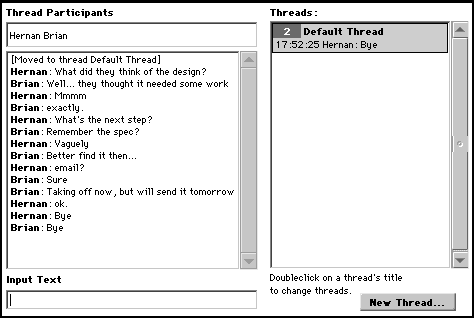
Traditionally this type of chat room uses `channels' to divide up conversations. Unfortunately, channels are unwieldy for many users because they are difficult to create and need to be explicitly removed. In order to make the system more usable, we needed to modify channels so they were much easier to create and maintain. We did this by changing the notion of channel to what we termed as `threads.' Conceptually, a chat room became a collection of threads. Like a physical room, chat rooms are permanent in nature. Threads are ephemeral, and they represent a group of people discussing a certain topic.

Figure 3: Threads Panel
Our version followed the traditional layout of these systems (see Figure 3). There was a list of users, a transcript display, a text entry field and a list of the current threads. On entering this chat room, the user was placed in the default thread. If users realize that their current conversation with a subgroup is distinct enough to deserve its own thread, they can click a button to create a new thread. This brings up a dialog asking the creator to enter the topic for the new thread, after which the thread is created and the creator is moved to it. The other people in the creator's original thread receive a message informing them that the creator has moved to the new thread to discuss the topic in question. They can then choose to move to the new thread by double clicking on it. Threads cease to exist when no participants remain in them.
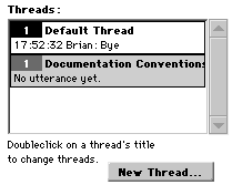
To address the issue of maintaining peripheral awareness, we augmented the representation of each thread in the list to display the last utterance in the chat room and the time it was said (see Figure 4). The last utterance was updated in a regular interval. Users liked this but wanted more information. They often saw conversations they might be interested in, but weren't sure. This is much like overhearing a word (one's name for instance) in another conversation and focusing for a moment to see if that conversation is of interest. To address this, we added the ability to mouse down on a thread to see the last few lines of conversation there. If users liked what they saw, they could choose to switch to that thread. Similarly when users switched into a new thread, they wanted to see a complete transcript, not just what happened since they joined.
Virtual World chat rooms use the notions of place and location to divide up conversations, but unfortunately this does not solve the problem of multiple threads of conversation. To examine this we built a simple, graphical chat room similar to the Palace. Avatars consisted of a picture and a name. The world was a large scrolling two dimensional field and the users could move their avatars with arrow keys or with the mouse.
Our first idea to address the issue of threads was to use proximity to determine conversations. Here the screen was divided into two sections. On one side was the avatar window. On the other was the standard chat panel consisting of a transcript display and a text entry field. Users would only hear the utterances of people who were within a certain radius.

Figure 4: Ham Radio Style Window with Threads>
This design worked very poorly. First, proximity didn't provide users with a good metric of conversations. They ended up spending a lot of time trying to place themselves in the right space to hear everything they were interested in. One user noted this was made worse by the fact that the avatars and the conversation were in two separate parts of the window. The design also severely limited the amount of peripheral awareness each user had. They could only see other conversations near them, and these conversations appeared over top their own. We then tried to refine this idea by having two transcript windows, one for people near by and one for everyone else. This helped, but seeing all other conversations overlaid was uninformative to users because it was hard to determine where the utterances came from.
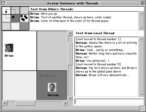
Rather than continue to refine this idea, we decided on a different approach. We attempted to add the ham radio metaphor of channels to this chat room. We did this by dividing the world into a grid of colored boxes. Each box represented a channel. In one transcript window, users saw the transcript of people in their box and in another they saw a color coded transcript of all other conversations (see Figure 5).
People greatly preferred the notion of boxes. It simplified organizing conversations and it made thread switching trivial. They also liked the color coding as it gave an easy reference for finding where people were and moving there. Some users found the secondary transcript window too cluttered, but were able to understand it a lot easier. Most users still found the separation between avatar and conversation very disturbing. We tried yet another design. This time, we replaced the transcript panels and text entry field with cartoon style balloons that appeared over the avatar's heads. This worked much better but we needed to address peripheral awareness.
To give peripheral awareness we added an overview to the window. The overview provided a representation of the entire space to the user including the miniature versions of the colored boxes, the users (represented as tiny squares) and the section of the world the user currently could see in their window (with a rectangular frame). This gave the user a sense of where conversations were happening and how many people were involved. We allowed the user to move around the world by clicking on the overview to move the frame. We also allowed the user to mouse over various user squares to see who each user was. Finally, we allowed the user to double click on the boxes to pop up a balloon which displays the most recent utterances in the transcript.
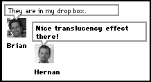
Finally, in an effort to add the best of telephone chat rooms we modified the design of our speech balloons. The balloons were changed to match the design of our telephone style text fields described in the section above. This made it possible to allow us to give people within a channel character by character updates and still retain the ability to display channel transcripts in the overview (see Figure 6).

Figure 5: Avatar room. Colored Squares Represent Actual Threads
Our tests showed that use of threads was very effective in keeping conversations coherent. Because threads tended to be composed of very few people, interruptions and unrelated utterances were much less frequent.
We learnt that threads will be used most effectively when the overhead in their creation, use and visualization is minimal. Therefore we went from explicit thread creation using a button to the spatial notion of a thread as a colored part of a room. This design allowed users to change and visualize threads with little effort.

Figure 6: Balloon Avatars with Partial Update Field
We also devoted much of our time to different means to provide peripheral awareness. The simplest one was the global transcript where text from every thread was printed as it was received. While providing complete information, the frantically active global transcript drew too much focus away from the local context. The threads list of Figure 4 with its regular (but not constant) updates provided good snapshots without distracting too heavily, but it could not present complete information. While these were effective at creating some level of peripheral awareness, we were not fully satisfied with either approach.
With regards to our chat rooms, there was no clear favorite. People liked the responsiveness of telephone style interfaces, but such a system can only support a few participants at a time. Our users also enjoyed the avatar worlds a great deal and tended to be more playful in them. They particularly liked when their avatar contained their actual picture.
A general design principle we learned was to always keep in mind the impact each aspect of the design will have on network requirements. There are many tricks you can use to help minimize traffic. To maintain maximum updates, dividing the world into threads helps. Also having a scalable input field can help balance the network load.
With regard to user tests we discovered that it is important to have a real world task for users to perform in the chat room. In so doing, users are more likely to push the limits of the interface and are more vocal with their concerns.
We experimented briefly with a fully dynamic thread system that required no user intervention to manage thread creation. That work was too preliminary to present here, but is worth further exploration.
Another area worth looking into is using more elaborate mechanisms for providing peripheral awareness. We could provide simple programmable agents to monitor the data stream and notify the user when a certain word was matched, certain people spoke or an arbitrary condition was met.
Interfaces for text based chat rooms are surprisingly understudied given their widespread use. We hope that our work can be directly applied to improve the usability of existing chat systems and that it points out the need for further research in this domain.
We wish to thank the following people for their help in the design and testing of these ideas: Jim Spohrer, John Lilly, Lori Leahy, Stephanie Houde, Charlie Hill, Harry Sadler, Gary Young, Scott Kleper, Jeremy Hendrickson, Michael Hanson, Byron Henderson and Martin Koning-Bastiaan. Special thanks to John Lilly and Kristen Kadner for their careful review of early drafts of this paper and to Jim Spohrer for his long-time support and guidance of our work at Apple.
1. Blizzard Entertainment. battle.net http://battle.net/
2. JavaSoft, Inc. The Java Programming Language. http://www.javasoft.com/
3. Kurlander, D., Skelly T. and Selesin, D. Comic Chat Proceedings of SIGGRAPH '96.
4. Morningstar, C. and Farmer, F.R., The Lessons of Lucasfilm's Habitat. in Cyberspace: First Steps. Benedikt, M., ed. MIT Press, Cambridge, MA. 1991. 273-301
5. Netscape, Inc. Internet Foundation Classes. http://developer.netscape.com/doc/manuals/ifc/
6. ObjectSpace. Java Generic Collection Library. http://www.objectspace.com/jgl
7. Oikarinen, J. and Reed, D. Internet Relay Chat Protocol. Internet RFC #1459. May 1993
8. The Palace InstantPalace http://www.thePalace.com/
9. VocalTec. Internet Phone. http://www.internetphone.com/
Hernan Epelman-Wang is a Senior Scientist at Apple Computer, Inc. where he worked for five years in the Advanced Technology Group. He is currently working on native Java support for Rhapsody.
Brian Roddy spent five years at Apple as a Senior Scientist in the Advanced Technology Group. He has recently cofounded an interface consulting company called Reactivity.
Brian J. Roddy
3821 20th. Street, #4
San Francisco, CA 94114
USA
email: roddy@reactivity.com
Tel: +1-415-826 6493
Hernan Epelman-Wang
1 Infinite Loop, MS: 302-1NS
Cupertino, CA 95014
USA
email: hernan@apple.com
Tel: +1-408-974 4112
Issue |
Article |
Vol.30 No.2, April 1998 |
Article |
Issue |