It is understandable that there are applications and websites with bad user interfaces: they are made by people who don't understand the issues, who haven't enough experience with usability. But I am constantly amazed by serious websites that have apparently wilfully been made difficult to use. What could the creators of these sites be thinking? Why do they imagine that people want to go to so much trouble using their creations? Let me give you two quick examples.
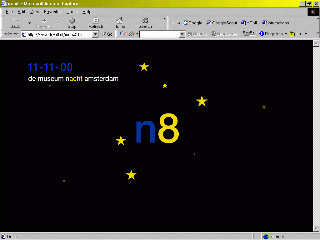
Exhibit A is the website that was the source of information about an occasion when museums in the Netherlands were open all night. You can't see this in the image, but the stars are rotating around the central "N8". If you clicked on the N8 you got the message "click on the stars for information about the events that are happening". It turned out that each star was a hyperlink to a different event. You not only had to have good hand-eye co-ordination to click on a rotating star, but you had to keep track of how many stars you had already clicked, so you could be sure that you had seen them all, and since you couldn't see which stars you had already clicked on, you had to keep on trying until you finally clicked one you hadn't yet seen…

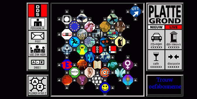
Exhibit B is the website of a Dutch internet service provider of sorts. It offers homepages to people using a city analogy: there are 'squares' based on some topic, and the people live in 'houses' around these squares. This image was the home page of the provider. Each octagon represents one 'square' (you can see the houses around them). The image on the square is meant to represent the topic of that square. You can probably guess what some of the squares are. How about the topic Film? Which square is that?
 I have met some of the makers of
such websites. They seem typically to be graphics designers, they seem to be
afraid of their websites appearing dull. If I were to stereotype them, I
would say they are the sort of people who would more likely go to the Doors
of the Perception conference than CHI.
It wasn't until I read Aaron Marcus's article Cultural Dimensions and Global Web-User Interface Design in interactions 7.4 that the light dawned. His article reviews research that identified five variables that differentiate culture. One of those variables is "Uncertainty Avoidance". Reading the description of what that means for a culture made me realise: graphics designers have a culture of low uncertainty avoidance! The problem with their websites is a classic mistake: they are designing for themselves rather than their public.
There's more to culture than national borders!
© Copyright Steven Pemberton, Amsterdam, 2001. All rights reserved.
First published in ACM/Interactions, September 2001